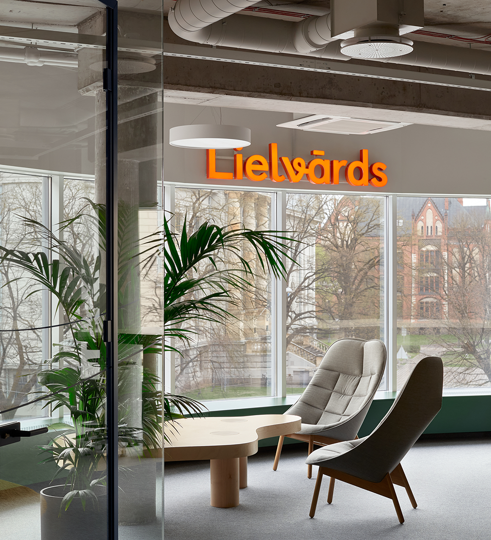
Celebrating its 30th anniversary, the educational company Lielvārds has created the Lielvārds 360 approach, which combines polygraphic and digital learning tools to help modernise the learning process. This new attitude is also embodied in the interior of the Lielvārds office, designed by the architecture studio Gaiss. The design studio Associates Partners et Sons has developed a new brand identity, and the marketing agency Wknd has created a video business card for the Lielvārds 360 approach.
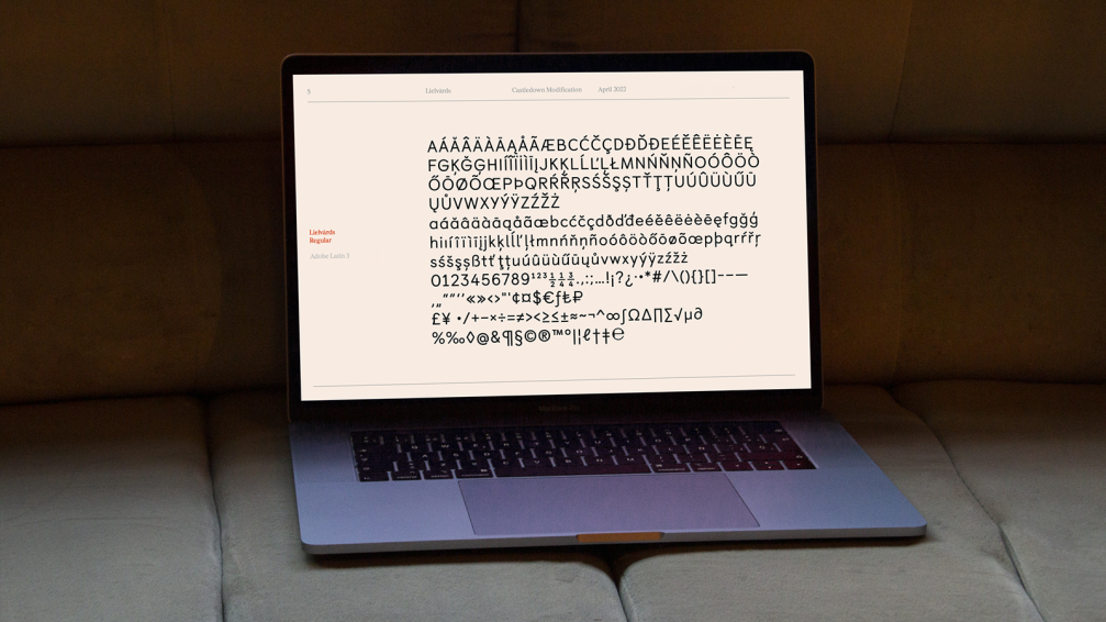
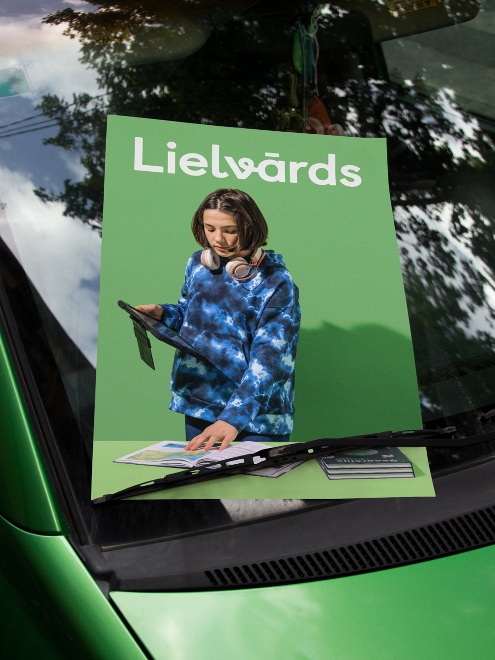
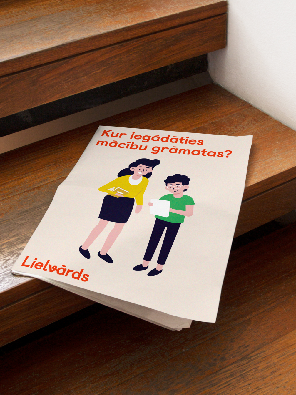
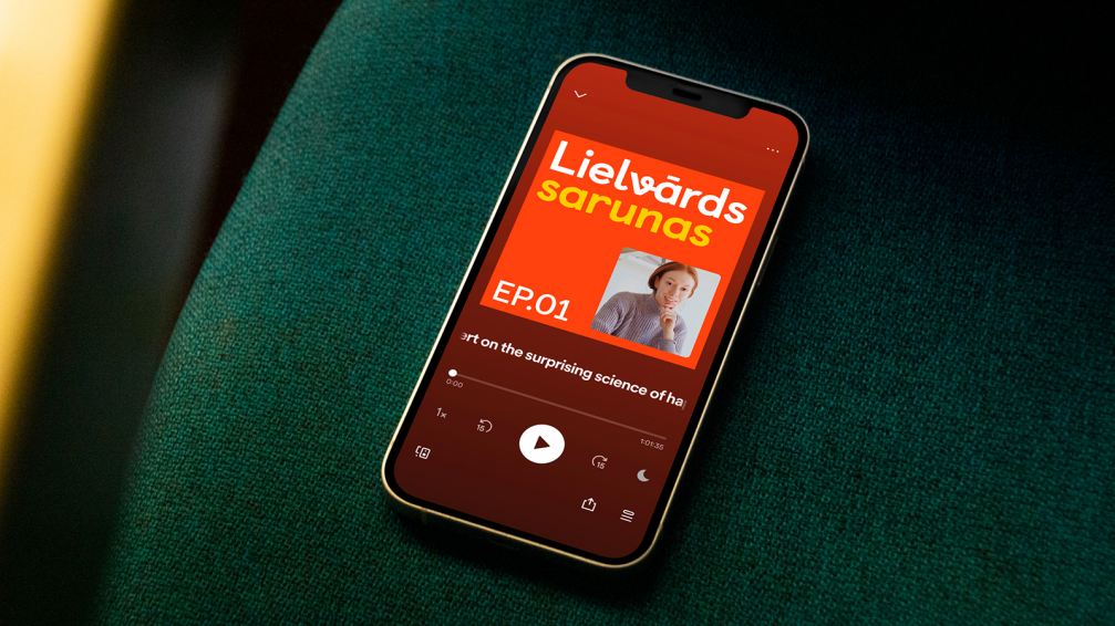
In the new Lielvārds identity, Associates Partners et Sons wanted to combine the company’s vast experience, growth mindset approach to work, and the newly introduced Lielvārds 360 concept, which strives to build subject-centred educational ecosystems. «Visually, this ability to connect and combine is manifested in an inconspicuous loop that connects the letters «v» and«ā»,» says Edgars Zvirgzdiņš, the leading designer of Associates Partners et Sons. Especially for this project, the Castledown font was adapted in cooperation with the type foundry house Colophon. The diverse approach of Lielvārds 360 is also illustrated by the brand video, in which Wknd uses different means of expression — animation, 3D graphics, filmed material, motion graphics and sound.
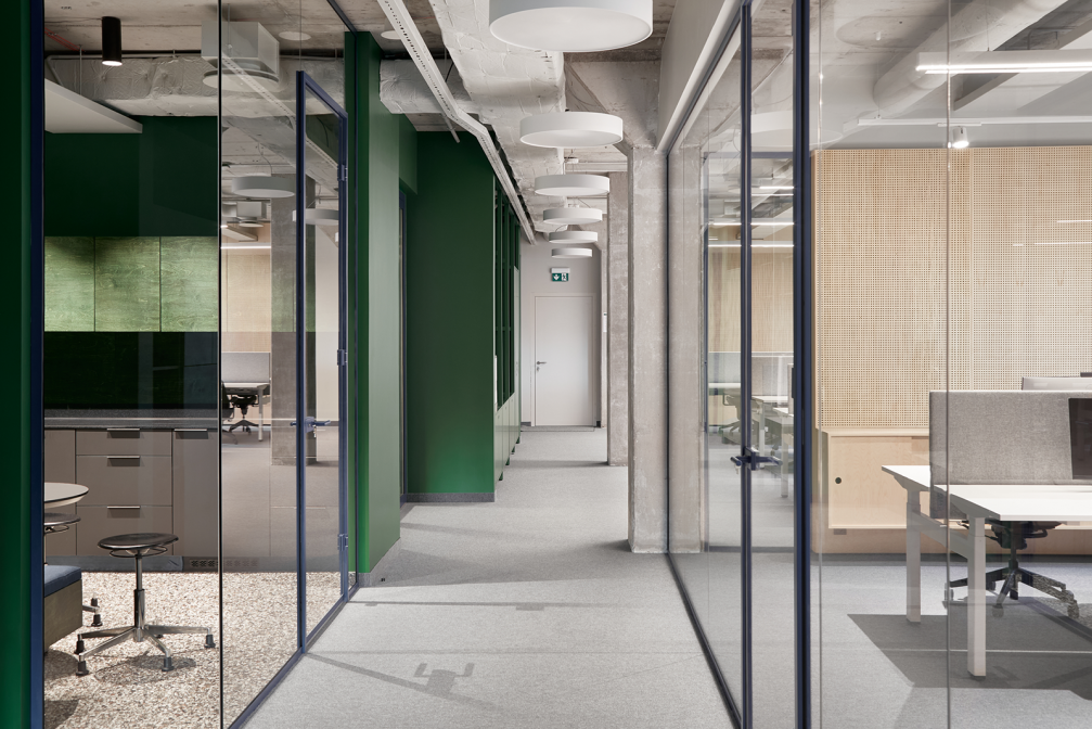
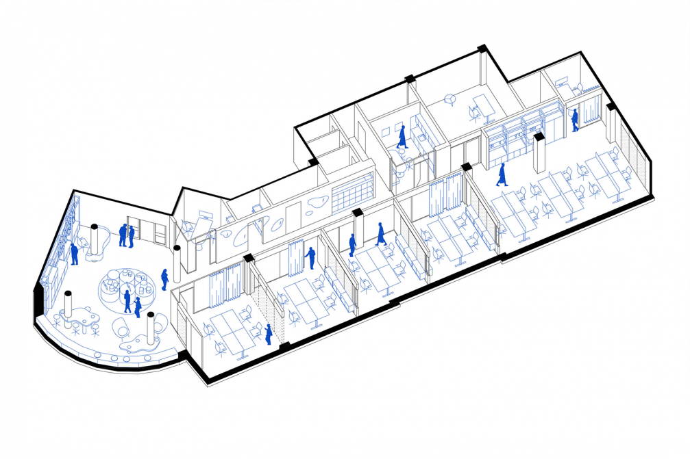
Diversity is also reflected in the new Lielvārds headquarters in Riga, where various facilities — a showroom, lecture spaces, workspaces, formal and informal meeting areas, and video and audio recording studios — are all under one roof. Kārlis Melzobs, the leading architect at Gaiss, states that the main focus of the design is the well-being of users — access to natural daylight, acoustic climate, ergonomics, flexible layout, and multifunctional spaces. «Glazed and timber-lined partitions are arranged to seek a balance between togetherness and the possibility to focus, meanwhile also allowing to work in isolated teams during pandemic restrictions,» says Kārlis.
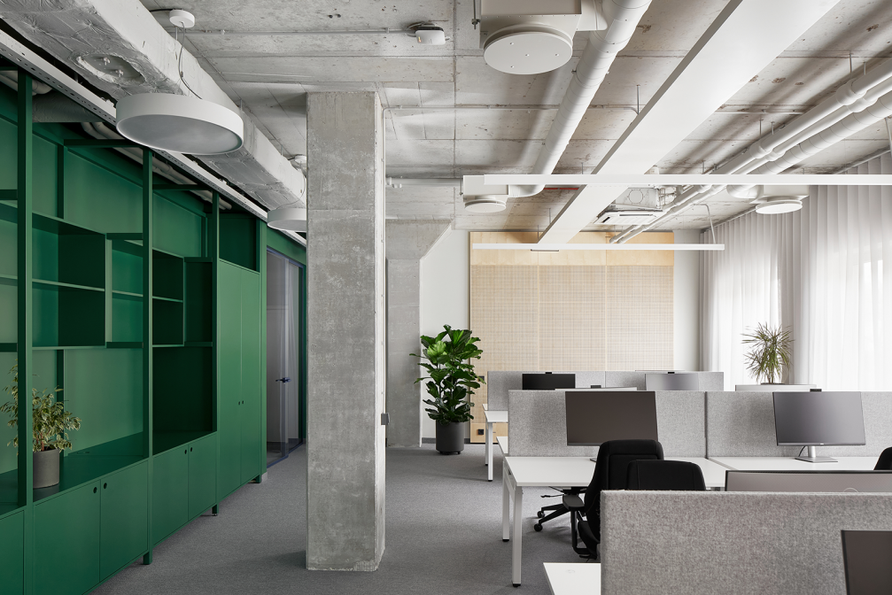
The office interior is designed to be flexible and easy to transform. The open lounge area serves both as the reception and showroom and also as an informal work area. Non-personalised workspaces allow for optimised use of the office space, which means that any employee can work at a vacant desk, and at the end of the day can store their belongings in a dedicated locker. Thus, Lielvārds has also abandoned the hierarchy in the layout of the premises, bringing a horizontal management model to life. The company’s constantly changing team structure requires that the space layout does not define specific functionality and can be used for various purposes. The lecture area can be used as a single large conference room or divided by an acoustic partition to get two smaller meeting spaces or workrooms.
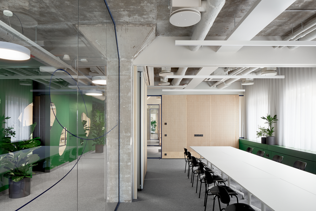
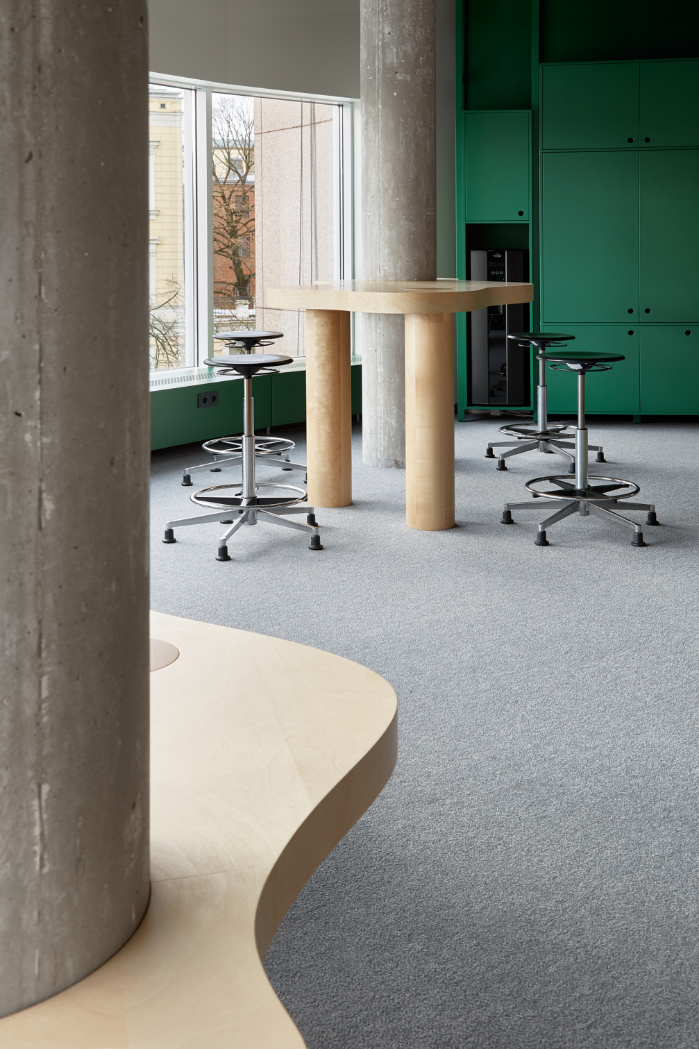
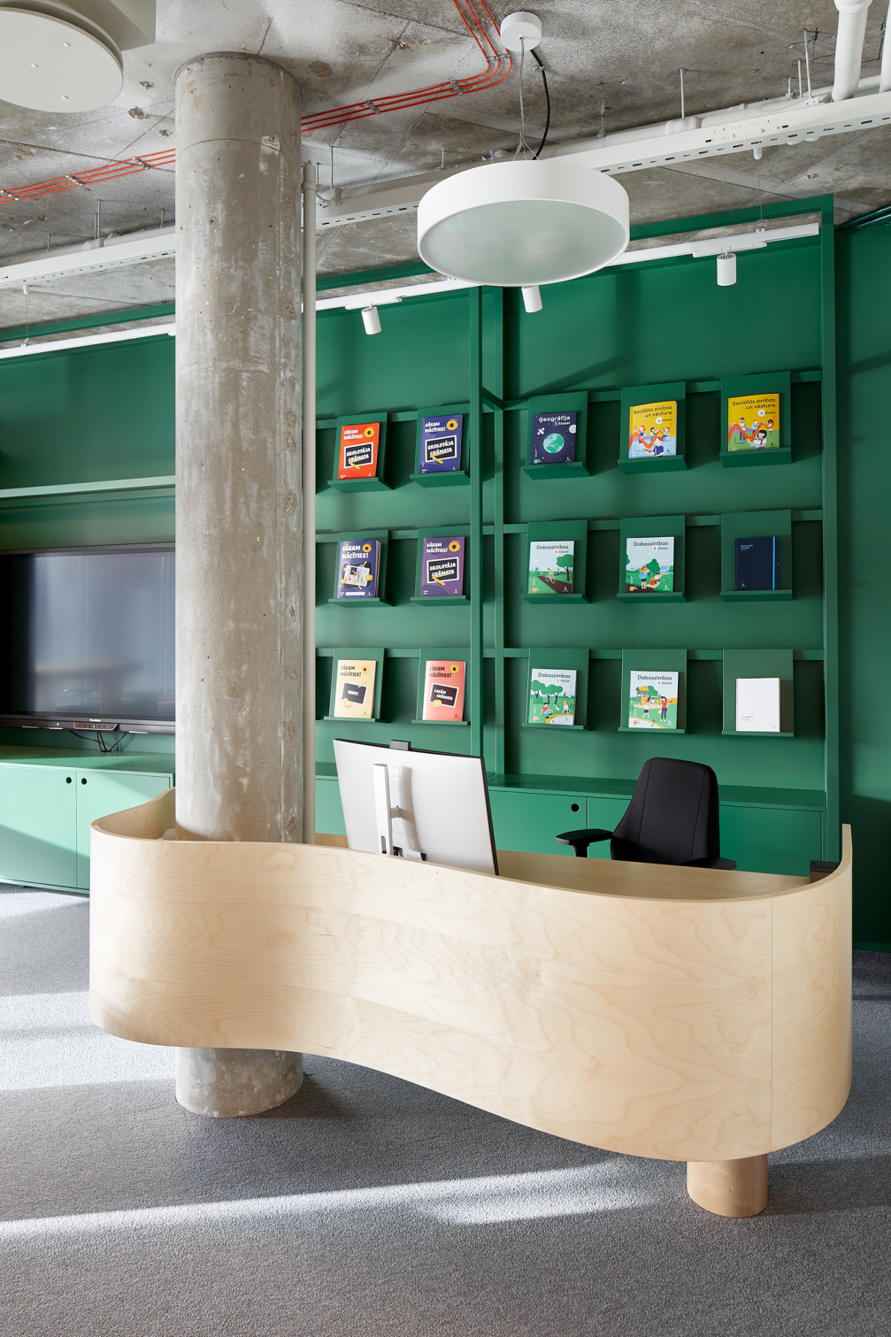
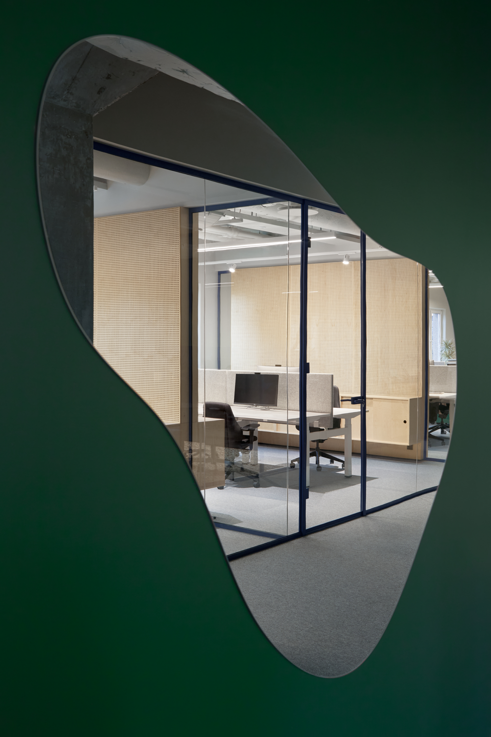
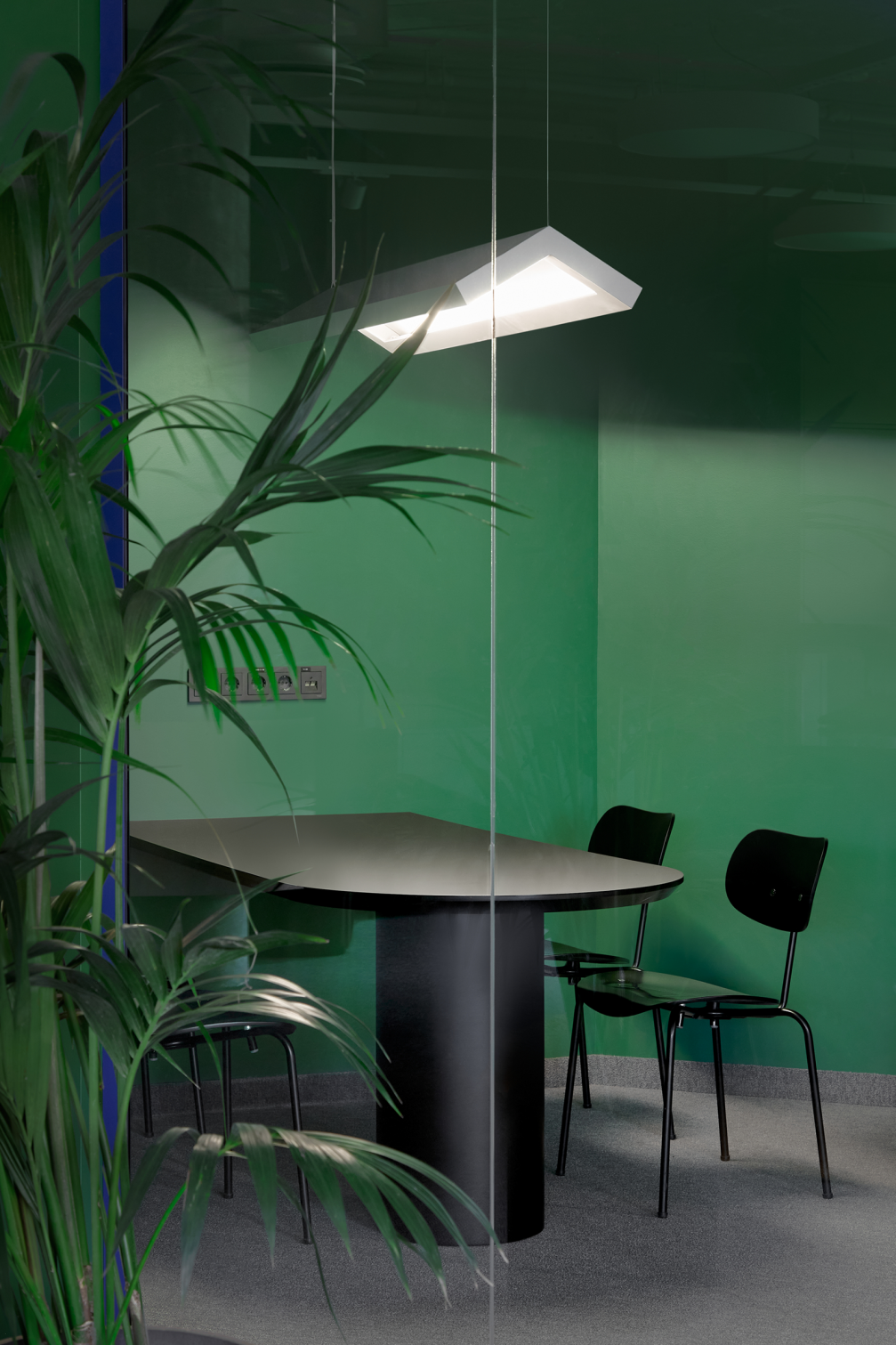
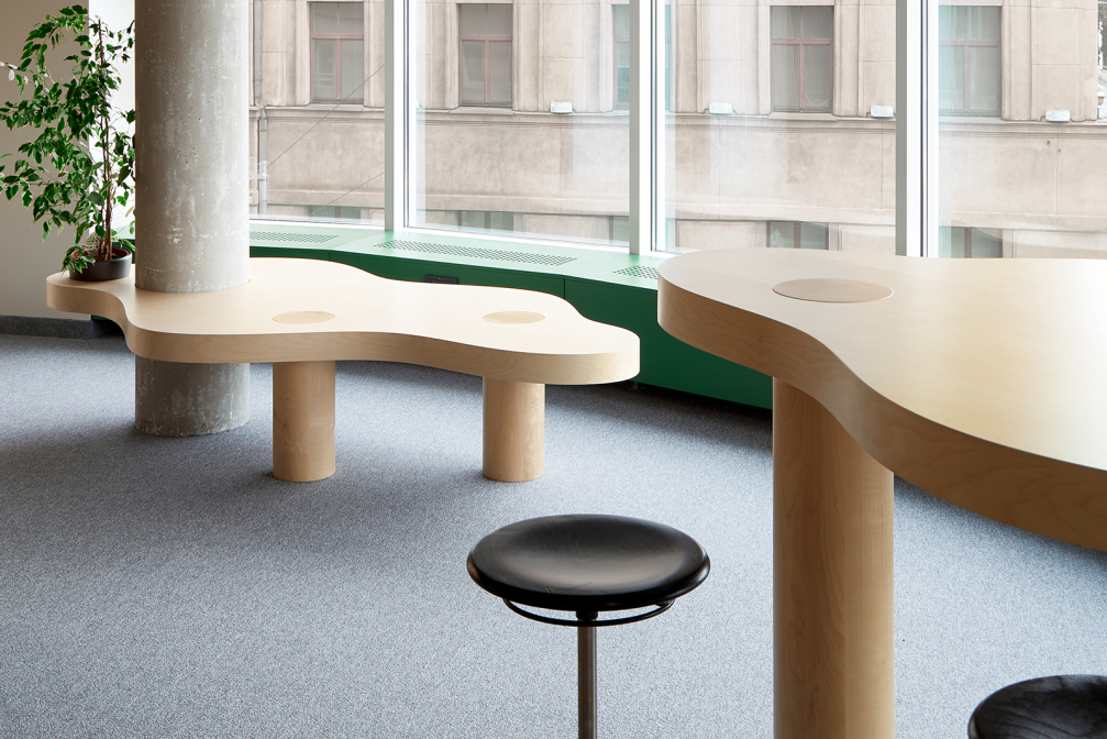
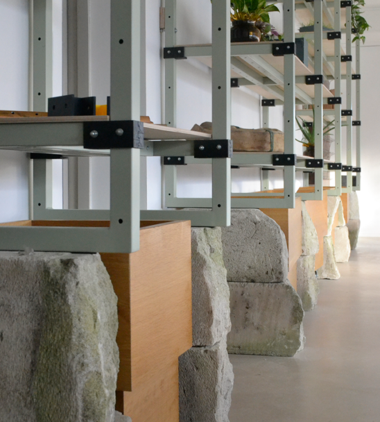
The interior concept is based on the architects desire to exhibit true and robust materiality. The starting point for this approach is the existing concrete structure of the building with its impressive columns, which reveal its constructive logic and highlight the existing values. The perforated plywood used to line the walls brings the presence of nature into the space, which is further enhanced by the green colour used in the interior and the flowing shapes of the furniture.
When creating the interior, various aspects of sustainability have also been considered. The perforated plywood is a locally sourced material, while the carpet tiles used are made from recycled or organic fibres. In order to save resources, furniture from the company’s previous work space was used in the office design. The layout of the space allows for the maximum use of natural daylight, while artificial lighting control is organised with an automated system that regulates light intensity, using solar sensors on the building facade, as well as with the help of presence sensors, which reduce the amount of light in areas that are not actively used at the given moment. Encouraging employees to lead a greener and more active lifestyle, a shower is also available in the office, giving the opportunity to come to work by bike or running.
Viedokļi