
In preparation for the National Design Award of Latvia, every Thursday designer Miķelis Baštiks interviews one of the members of the competition’s jury in a video call. In cooperation with the organisers of the Award, we are publishing summaries of these conversations. In this interview, Miķelis talks to communication design expert Martin Foessleitner who compares information design to Italian espresso and explains why we need a design supermarket.
Martin Foessleitner holds MA in Business Administration and has ten years of management experience in the global Japanese digital imaging company Konica Minolta — first as a Product Manager in Eastern Europe and later, as Marketing Director in Austria. In 1999, he founded hi-pe.at, a design studio applying information and universal design for municipalities, industrial enterprises and non-profit organisations. He serves as an Executive Board member of several international design organisations, including IIID and BEDA, and teaches in various universities. One of them is Art Academy of Latvia. Martin is the Chairman of the Jury of this year’s National Design Award of Latvia.
You studied business administration, and you have over 10 years of management experience in the Japanese company Konica Minolta. How come you started your career with business administration?
I grew up on the countryside. And when you grow up on the countryside, you have this dream of Paris, New York, London… I had an affinity for drawing and things like that. Education was a major topic in our family, and they said, and I must say they were right, that I was not good enough to go to an art academy. But then I figured out that if you study business administration, at the very end, in the fifth or sixth year, you can specialise in advertising. And that was the reason why I chose to study business administration. Now I’m quite happy about that, because it gives you a background for how to survive and how to make money with your passion of design.
Would you say that having business management skills is essential for creative professions as well?
No. But you should have a friend or a colleague [that has them]. Don’t try to be everything. If you are a talented designer, be a designer. But don’t get creative with things you don’t like, or you don’t have a passion for. I can only say — team up with someone, then you are unbeatable. And to have a lawyer would also be a good idea.
What was your transition from business administration to design?
It happened with my position in this Japanese company. We had to train sales representatives. And, you know, sales representatives, they are so focused, they have so little time, and money is everything. Speed is the most important thing for them. This was an excellent training for me on how to condense and distill information to the very minimum, because you only have this little bit of time to talk with sales representatives, and you always have to seduce them. They’re not listening. You have to seduce them, like in advertising.
You founded your design studio hi-pe.at in 1999, and it’s not just a regular design studio — you work with information design. How and why did you decide to do that?
The 1990s was transition from a black and white stand-alone copier to a full colour printer in the network. This was a change of paradigm. And this was a challenge — how to put your mind in a totally different category, how to deal with things you are not familiar with. Especially in sales — how not to lose your face when you’re standing in front of a client. We developed a training concept with Konica Minolta. We specialised in this change of paradigms — how to get into a new field of business, how to deal with things you’ve never heard about before. This was the initial point. After that we trained companies from Finland to Greece and to Spain, but not only in the [printing] machine or its functions but in this change of perspective. Years later, someone told us that the thing we do is called information design. We had no idea because we hadn’t been the best in graphics, we hadn’t been the best in pedagogy, we had no idea of sales, no idea of techniques. But the combination of it, someone told us, is information design, and we have been very happy to have a place for that.
Can you give a quick description — what is information design?
It’s quite simple — how to understand something new which you are not familiar with. It could be a physical place, like a foreign city, — how to understand the layout, how to get a grip on the navigation and orientation? It could also be a new topic — how to approach it, how to create different levels of information, how to set up the hierarchy? What are the linking elements so that you are motivated and engaged and how to do it as quickly as possible? I think speed is one of the most important elements in that. Otherwise, you lose attention.
Why is speed so important?
Because your your hippocampus says: «Ah, if it takes too long, that’s too tiring. Show me something more exciting!» Basically, it’s a kind of time management. How quickly can you read a situation, how quickly can you understand whether there’s service at the table or self service, how quickly can you understand where to go, and how quickly can you fall in love with something?
You have said that information design is like Italian espresso. Can you elaborate?
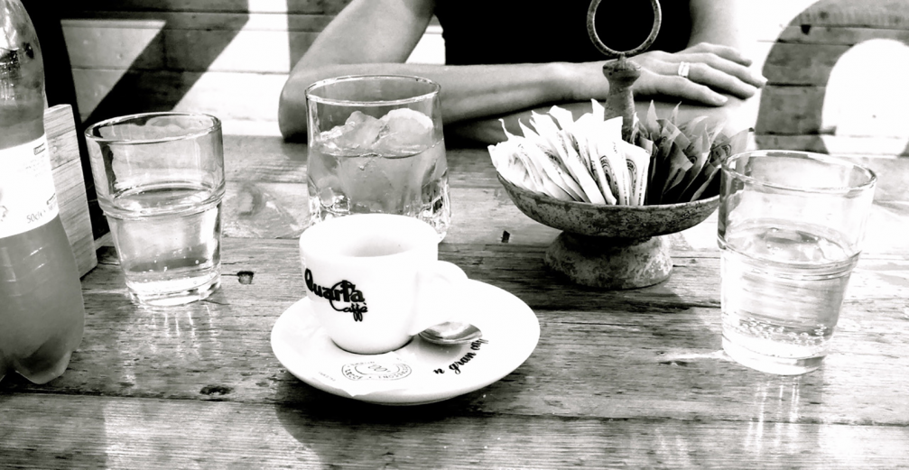
Just to have a clear differentiation — it’s not cappuccino, or cafe Americano. You know, for a cappuccino, you sit down, you have a nice chat, maybe a little bit of sweets on the side, you spend half an hour or even longer. For an espresso, if you just need a kick, you’ll go down into the bar, you meet some friends, exchange some words, sip the coffee, and you are again in a good condition. It is short, nevertheless, you need to have excellent beans, otherwise the taste is not really pleasurable. And it has to be beautiful. Simplicity, quality, quick, short, and aesthetic — these are the elements of espresso [and information design].

There has been a lot of research done and books written about design thinking. What are your thoughts about design thinking techniques? Do you use them in your daily practice?
Yes, we always apply it and it’s a nice framework. Basically, as a designer, you serve the community. And to serve the community, you have to understand what’s going on, which doesn’t mean you have to follow it, because as a designer, you bring in something new, you give a new perspective. As a designer, you put yourself in a situation where you know absolutely nothing about the topic. And then you just try to collect as many as possible dimensions, aspects, associations, feelings, meanings. And out of that you define the topic. Then you go for the first mock up and prototype. And then it’s an endless series of testing and testing, and testing to get more focused, and especially to get shorter, quicker. Also, the sustainability aspect. How can we avoid polluting and messing up the world with another design and another design? The real skill is to keep it to the absolute minimum.
What would be the first steps for somebody who wants to dive into design thinking?
Very simple. Take a word by random and ask ten people how they feel about it. You will be very surprised that there are so many different ways to look at it. We are now doing wayfinding [at the Art Academy of Latvia]. From all the very charming, smart students at the Academy, we asked thirty people to draw a map of the neighbourhood. And it’s so fascinating that everyone has a different map at the very end. But its the same neighbourhood. As a designer, you have to take this into account.
You’ve been involved with the Latvian design scene for more than seven years now. That’s quite some time and you probably have a good overview of things here. What are the things that we should improve regarding design education and design in general?
I can only reflect on what I have seen and experienced. I see this heritage and fantastic skills of craft. One student at the Academy, she even sharpens her pencil with a knife and not with a sharpener. And it was better than with the best sharpener you have seen! All these, I would say, very analog techniques, very old wisdom, big connection to nature, of course. The only one thing I can say, you could be a little bit more proud of what you have. There is no need to look for this tendency of being Nordic or anything else. I think Latvia itself is fascinating, it has a very authentic identity, it has a rich history of all different influences from the west, from the south, from the east, from the north. And it’s also always fascinating to see all your efforts to keep your language. I really appreciate that.
Thank you for that! There are five categories in the Latvian Design Award this year and there are many more in design industry in general. Do you think that designers should specialise in one particular aspect of design or should they be aware of all the different disciplines of design?
I would split it in three parts. First, you need a basic understanding of design in the sense of creation, composition, shapes, forms, aesthetic perception, so that you have a common language to deal with other designers. Secondly, if you want to meet the benchmark, you have to find your speciality where you are magic. Your specialisation in your craft, in your topic, in your discipline. Don’t do the things you don’t want to do, because then they won’t work out very well. And the third part is team up, not only with someone in business and in law, but team up with typographic, team up with analog, team up with coding, team up with whatever it is. We can’t do everything on our own, it’s not possible.
There are many discussions around awards as such. What are your thoughts on design awards — are they a good way to highlight the best works? Are they good or bad for the industry? And what should be celebrated in award shows?
You have two ways to see design awards. The one is the elite one where they say — this is the best. Or a more democratic way where you give a chance to build up a showroom.
Maybe you can play both ways, you just have to decide and not mix it up. What we’re really missing in design is a supermarket. You know, if you go into a supermarket, you have 20 different kinds of milk. Sooner or later, you start to understand the different concepts of milk, whether it’s the fat, whether it’s the durability, whether it’s how you can use it or whatever. We don’t have design supermarkets where you could see — oh, this work is like this, it can do this, but it’s not appropriate for that. Here’s the reason why it’s a little bit cheaper. This one is more expensive, because it’s even able to do that.
Every submission, if it meets some basic quality criteria is already part of the show. It’s like Olympic Games. If you have a minimum level of quality in entry, then every submission is a winner because you have a stage where you can present their different approaches, different thoughts, different designs, different ways to give answers to questions.
You will take part in the evaluation of the works of the Latvian Design Award. What do you hope to see in them? What do you expect?
First of all, the expression of the next generation. It will be fascinating how people respond to the situation we are in, how do we deal with the context? How do young people handle these things? On the other hand, of course, the professionals — how they react, how they build a new future based on the experience they have already. What will be the world of tomorrow? We don’t wait for the future, we are making it every second already. Awards are a sneak preview of what will be very popular and what will be part of our daily life in the future.
One final question — what is design for you? How do you explain this one word — design?
Well, if we go back to the meaning of the Italian word «designare», then we hint to something. And if we hint to something, we’re giving importance to it. So whether it’s a topic, a place, a product, a technology, or a social issue, we hint to it, and we have this ability of doing it. And then it’s just a platform for social interaction. We create places where people can meet people, feel welcomed, appreciated, respected, and we can give the feeling that having a cup of coffee is pleasure and a souvenir, and good memories. Design is giving importance and enjoying. And then there are 20,000 other definitions of design.



Viedokļi