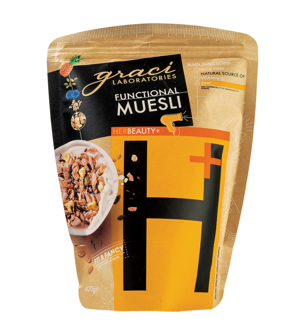
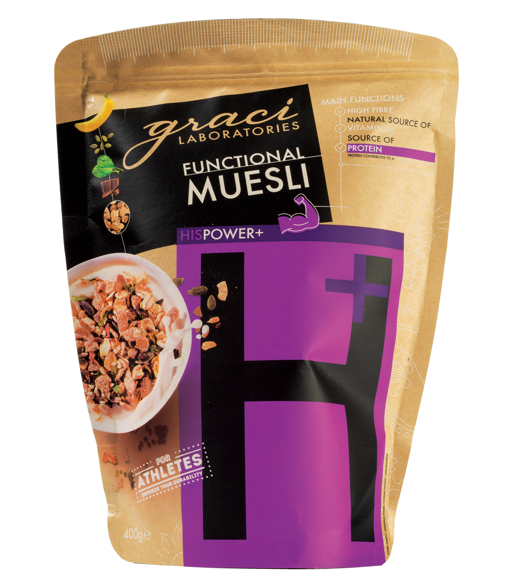
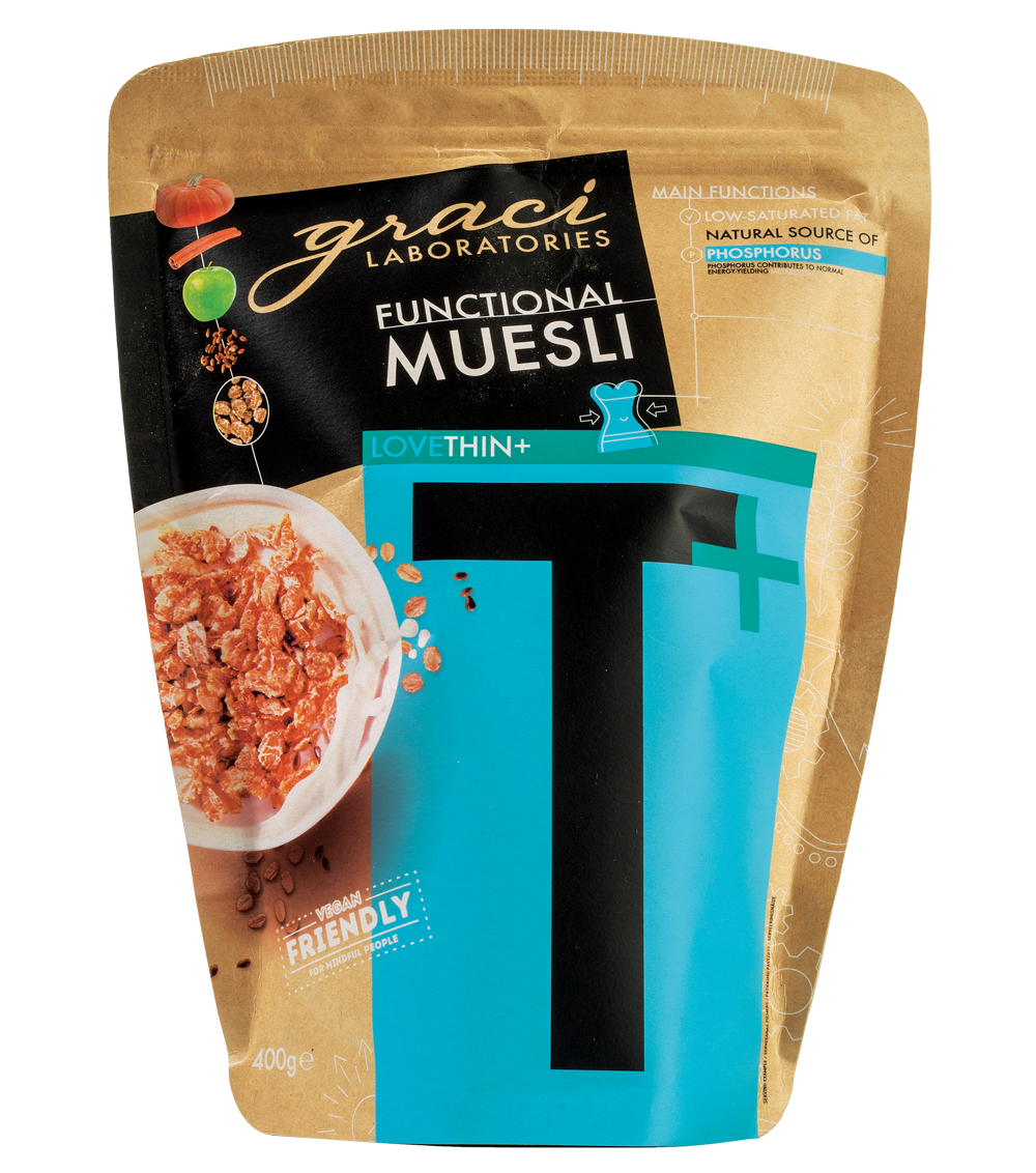
At the end of October, the packaging of «Graci’s» breakfast product line «Health», created by design agency «DPJN», was named «Best of the Best» at the prestigious Red Dot Design Award competition. The mueslis and porridges of the brand «Graci» have been in stores for more than five years, but the transition to a new packaging design took place at the beginning of 2018, coinciding with the modernisation of production processes and the entering of export markets.
Redesign of the packaging started in 2017, and the refreshed products appeared in stores at the beginning of this year. Using the previous design was no longer feasible — with the recent opening of a new production facility in Ādaži, manual labour, including the gluing of labels and sealing of the packaging, was replaced by mechanical manufacturing. The main reason for introducing English product names was the company’s rapid leap into international markets — currently «Graci» exports to more than 10 countries, and agreements have already been signed with dealers in other countries.
The redesign was entrusted to «DPJN», a studio that specialises in the design of food packaging, and in its 20 years of experience this is already its fourth (and the highest) Red Dot award. «The challenge was to retain the distinctive design features of the «Graci» brand while giving the product a fresh image. The basis for a successful cooperation with designers was a clearly defined assignment and, at the same time, reliance on their expertise. The process was complicated, laborious, but the result is worth the trouble,» comments Alise Balgalve, founder and CEO of the «Graci» brand.
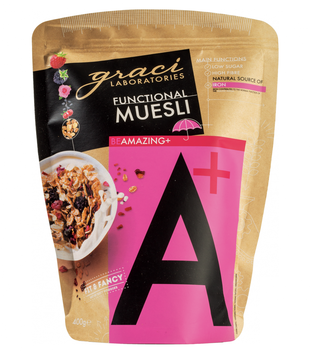
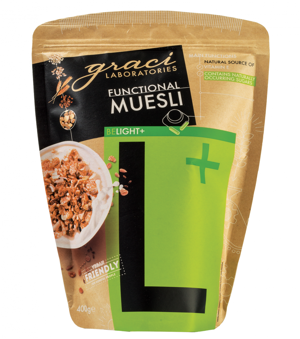
The new packaging has two main tasks: to protect the product and to attract the attention of the target customer. Alise explains: «It is important that the packaging is able to keep the muesli and porridges fresh until the expiration date. In addition, we focused on the aesthetics of the packets — they must look good and not crease on their way from the factory, warehouse, store shelves, shopping carts, and checkout conveyer belts to the shopping bag, pantry, and breakfast table. In order to keep the product fresh during use, there’s a ziplock that can be opened and sealed repeatedly.»
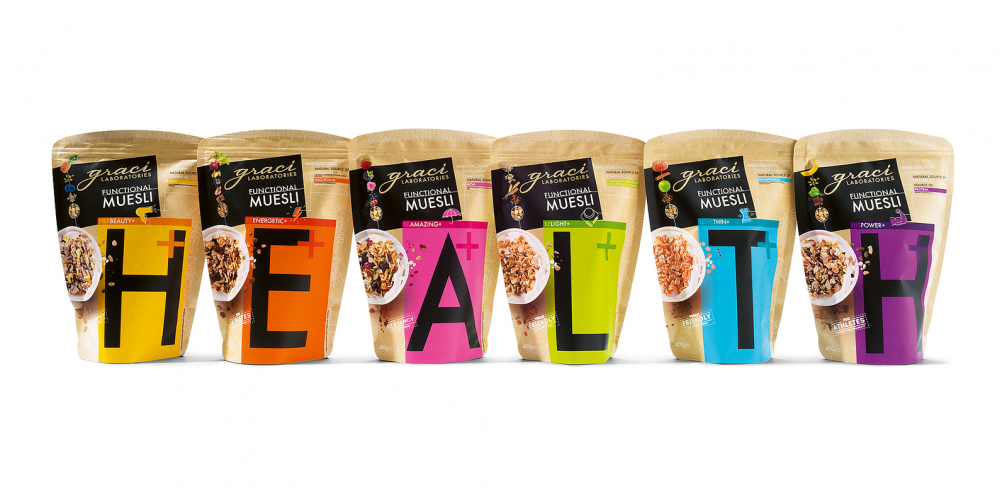
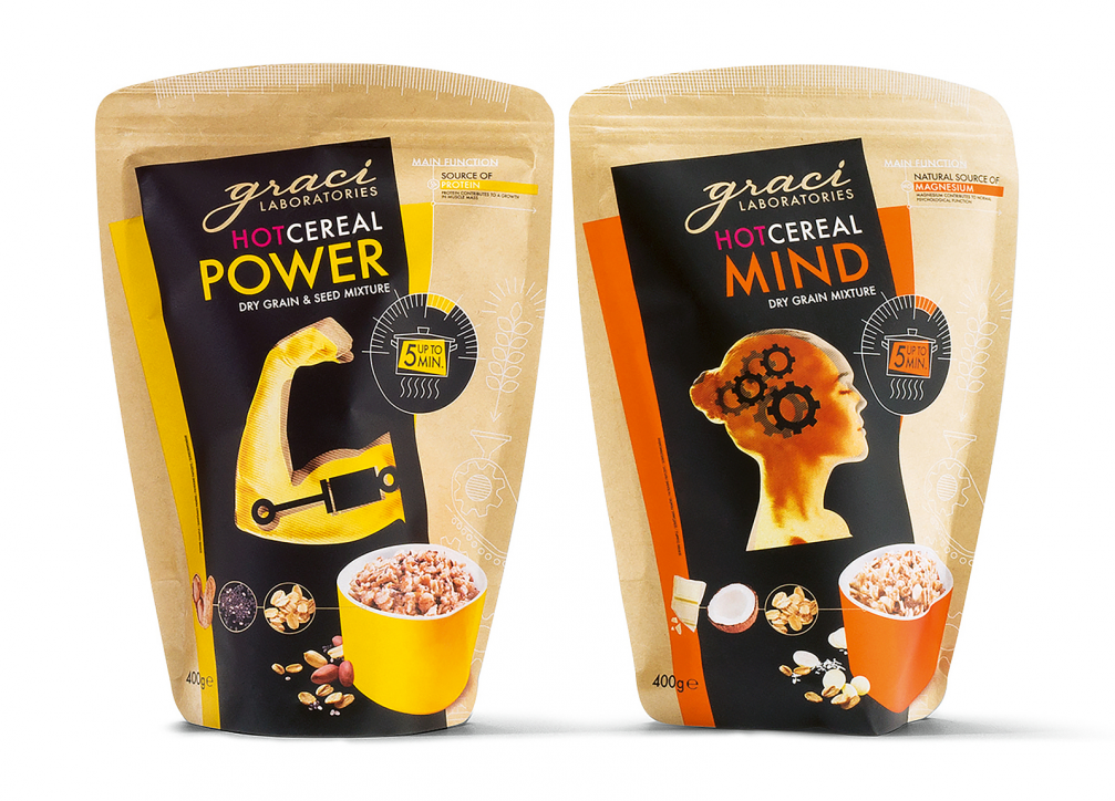
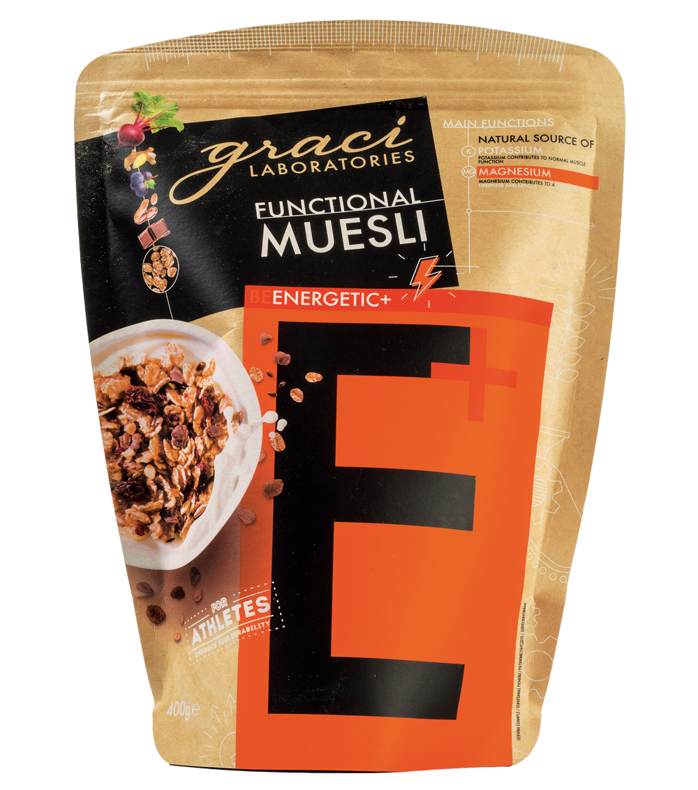
Market research shows that shoppers spend less and less time at the store shelves, and only 5–10% of people notice new products, so the goal was to create a visually impressive design. The big letters and the bright colours of the brand were retained and accentuated on the unbleached kraft paper packages. In addition, the design highlights details important to the brand, such as the function of each product in relation to health — this is achieved with the use of icons and smaller inscriptions. Arranging the «Graci» packets in a certain order creates the word HEALTH, which not only draws attention, but also is the main message of the brand. The letters provoke people to create new words out of them, which at the same time helps sales — buyers pick up the products in their hands. Alise adds: «It is interesting that the new design also solved the problem of «that expensive muesli» — for a long time people believed that our products are expensive although the price per kilogram was comparatively lower than for other similar products. The old design made the packaging visually smaller.»
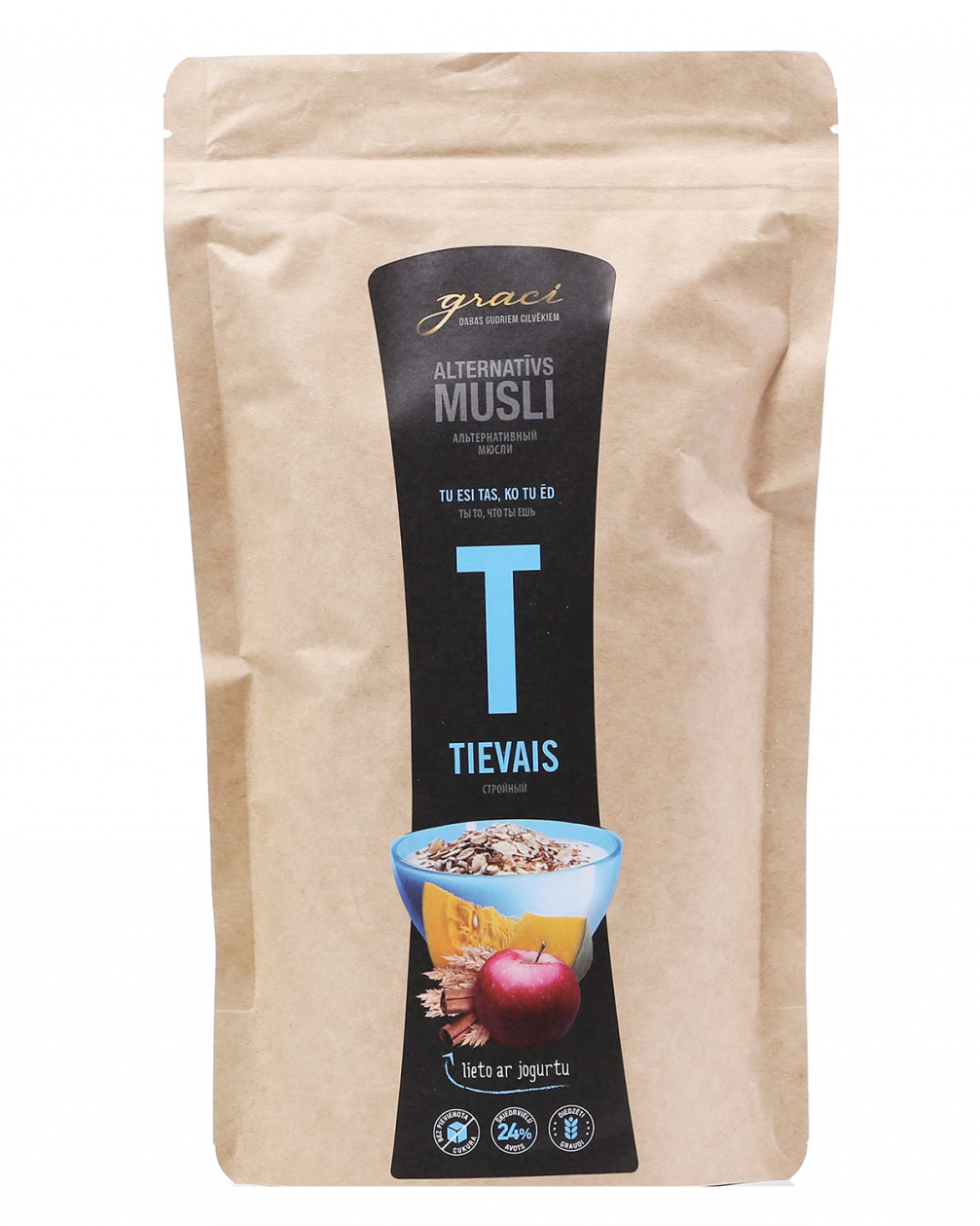
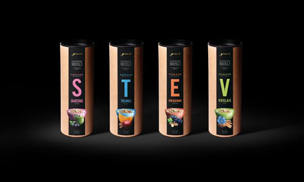
The «Health» collection of six types of muesli and four types of hot cereal are on view in the Red Dot Winners Selection 2018 exhibition at the Museum for Communication Berlin until January 13, 2019. Next year they will travel to the Red Dot Design Award in Essen. This will be the first Latvian packaging design to be displayed in the museum.

Viedokļi