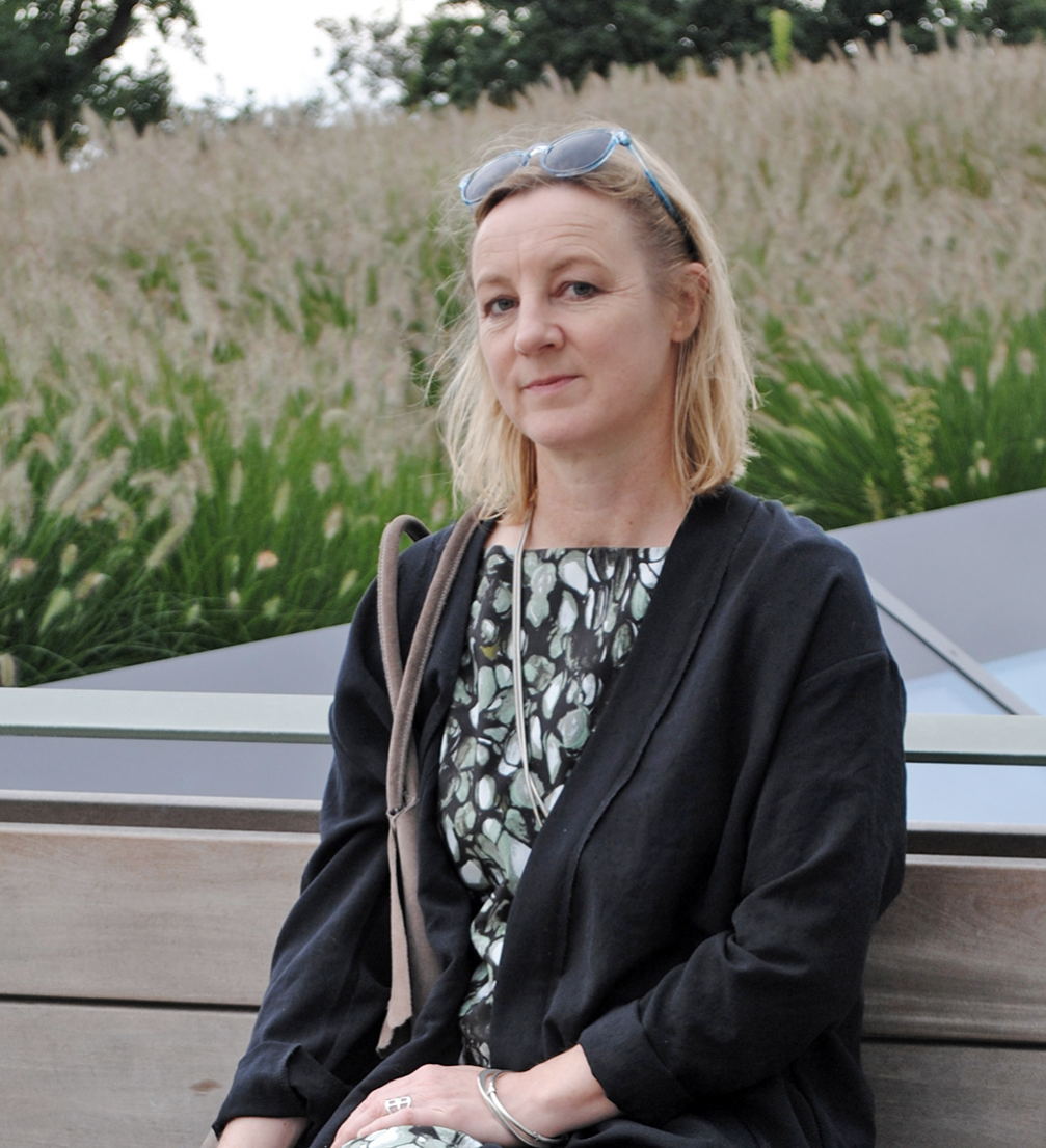
In this highly visual and digitalised era, the Berlin–based architecture magazine «uncube» has managed to retain an analogue feeling, bringing the qualities of print into a digital publication. Having been around the publishing block for quite a while, «uncube’s» editor–in–chief Sophie Lovell shares a frank view on contemporary digital media, the direction this industry is heading in and where it actually should go.
Despite the fact that «uncube» is an online publication, you still call it a magazine, it is published in issues, has a table of contents, and the navigation resembles pages. Why have you decided to keep these features characteristic to a printed magazine? And what does the blog add to «uncube»?
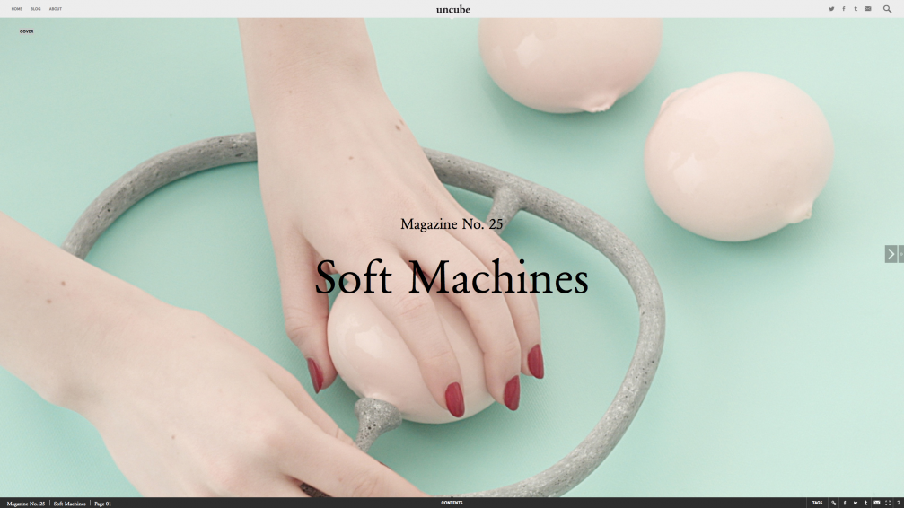
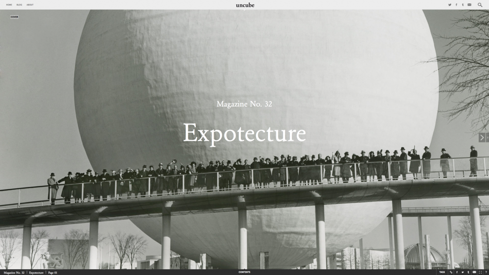
The original mandate for «uncube» was «like print, but without the paper», and the original intention was to have just the magazine, and the blog would be used only for very short news posts. As we developed the format over the first few issues, we felt that a one–to–one transfer from print to digital was not appropriate. «uncube» has a somewhat deconstructed format and this is intentional. The magazine is for story clusters around our chosen themes, the blog is for the non–feature, non–theme related section where we have more space for longer essays and interviews if we wish and much more images if we wish. Social media is the place for information and recommendations.
You have said you’re past the stage of just making a beautiful magazine. What personal ambitions do you wish to realize in «uncube»?
I said that I don’t just want to make something beautiful, I want to rethink publishing ― and I stand by that, even if it probably sounds totally arrogant. I have spent a fair few years working in publishing: writing, editing and art directing print magazines and books, as well as web platforms. Of course, we all want to make something beautiful, and I have been lucky enough to have worked on some extremely beautiful projects. But I have also watched the value of content fall ― collapse even ― through the rise of the digital sharing culture and as a result become corrupted, if that is the right word, by commercial forces. Few can afford to pay writers, illustrators and photographers the true value of the effort that has gone into creating their works, in particular when it comes to investigative journalism or, say, studio still–life photography. In order to survive, publishers have increasingly turned to copy–paste journalism or allowed advertising clients to pay for articles that are often disguised as editorial. My personal ambitions for «uncube» were and are that it has its own independent voice, that its content is chosen, commissioned and curated by its editors, and that advertisers and clients see the value of associating their name with a product that has integrity in this way. Last but most definitely not least, that our readers value «uncube» for its independent voice, for its vision in terms of issues it addresses and for its integrity.
What has been «uncube’s» strategy for fighting its way into today’s magazine market?
Patience. We concentrated on making something as good as we could, to the best of our ability, with the resources at our disposal and waited until an audience that thinks likewise finds us ― and they have.
You have talked about pushing the boundaries of digital publishing ― what are those borders that actually need to be pushed?
Anyone can chuck together a passably attractive website in WordPress. There are tens of thousands of them. And somehow they are all the same, in the same format, with the same raster behind them. That is great and democratic on the one hand, but 99% of them are utterly vacuous. Digital publishing needs better investment in the right directions: better art direction and above all better content. It astounds me how bad so much of it is, even, or particularly, at a high corporate level.
Regarding architecture and design writing and criticism, where would you like it to go?
Well, we are already going in a direction that we think is more valid from our point of view. Our aim as a magazine about «architecture and beyond» is to provide thought–provoking stories and information for our readers in a multidisciplinary way ― much more like information in the real world. Most qualified architects don’t ever get to build buildings ― and many don’t want to. What they are trained in is a holistic way of thinking that crosses many disciplines and has many useful applications for society and communities. «uncube» is there as food for thought for these kinds of thinkers.
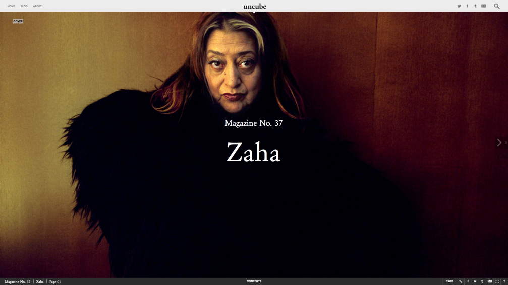
How do you come to the themes that you examine in each issue ― please elaborate on your process?
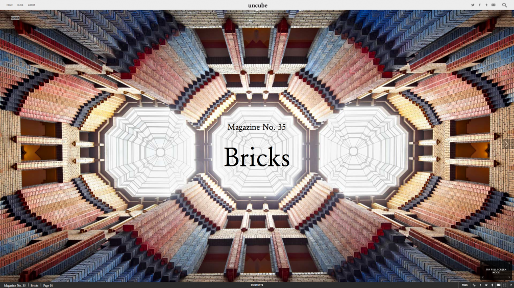
«uncube’s» themes tend to choose themselves. As a team we talk a lot together and are a very inquisitive bunch. Once we have decided on a theme that feels right for us and seems like something that needs to be thought about in more depth, then we approach story acquisition in a similar way. We usually end up collecting way too much material and then refine it and refine it until we are left with an issue.
In every issue of «uncube» you integrate various typefaces, layouts of images and text, and backgrounds for every article. Why have you chosen such an ever–changing design concept?
Our back–end system is actually very restrictive in some ways, which is why we love to push it and experiment with what it is capable of. It is also designed quite cleverly. It may look like every article or issue is very different but actually they are very similar. Our graphic designers are just super creative, and they are part of each issue and each story and understand what they are about so there is that graphic layer of interpretation of each piece and each theme as well. It is not just the writers at «uncube» that think about the theme of each issue in depth.
Is the interactivity there because the modern reader tends to lose focus quickly? Or is it a way of building awareness of the magazine through the visual memory of a person?
There are actually not that many of these in each issue. It just tends to feel very rich because of the sumptuous and dynamic design. «uncube» functions very much like a paper magazine ― but it has this visual movement aspect, which makes it something like film as well. But no amount of movement can disguise poor content. If we published «uncube» on paper, or if it were a video magazine, then I think and hope it would be just as rich. Our readers are not stupid, in fact they tend to be highly intelligent. We are not just putting flashing lights and bells on our content to keep their attention, every element is there for a good reason.
Do you feel that the visual form has overtrumped the text nowadays?
We are living in a highly developed visual sharing culture so of course the image has been taking precedence. But text is also visual. What is interesting over the past few years is the rise of the aural with audio books and podcasts…
Are you planning to go further in this interactivity?
Yes we are thinking about it, but not in terms of added gimmicks, that is not our way.

Viedokļi