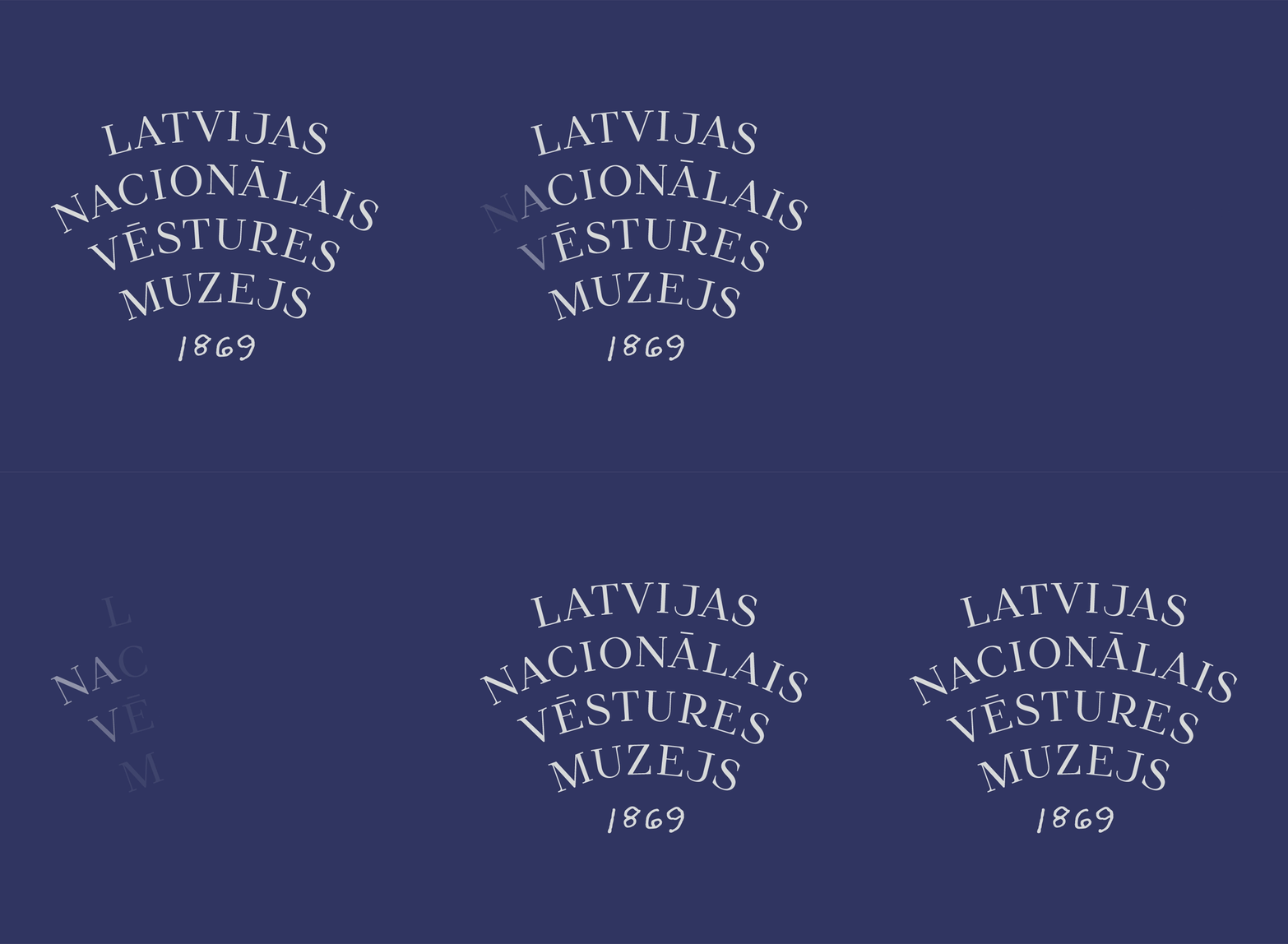
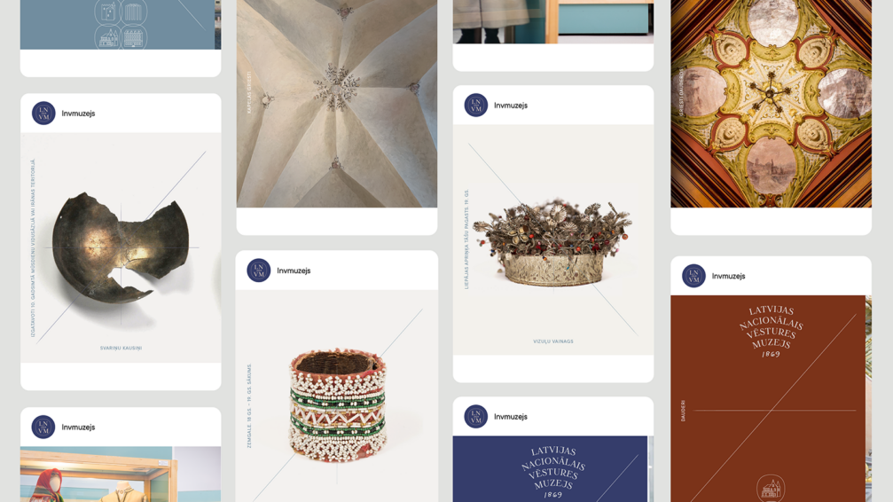
In creating the new visual identity of the Latvian National Museum of History (LNVM), the design studio Kid Design reflects on the passage of time and the museum’s mission — to collect, preserve, research, and promote. Design solutions combine references to the historical with contemporary elements. Kid Design has created a new unified wordmark and seals for each of the museum’s locations, with symmetrical compositions arranged on the «axis of time» forming an important part of the new identity.
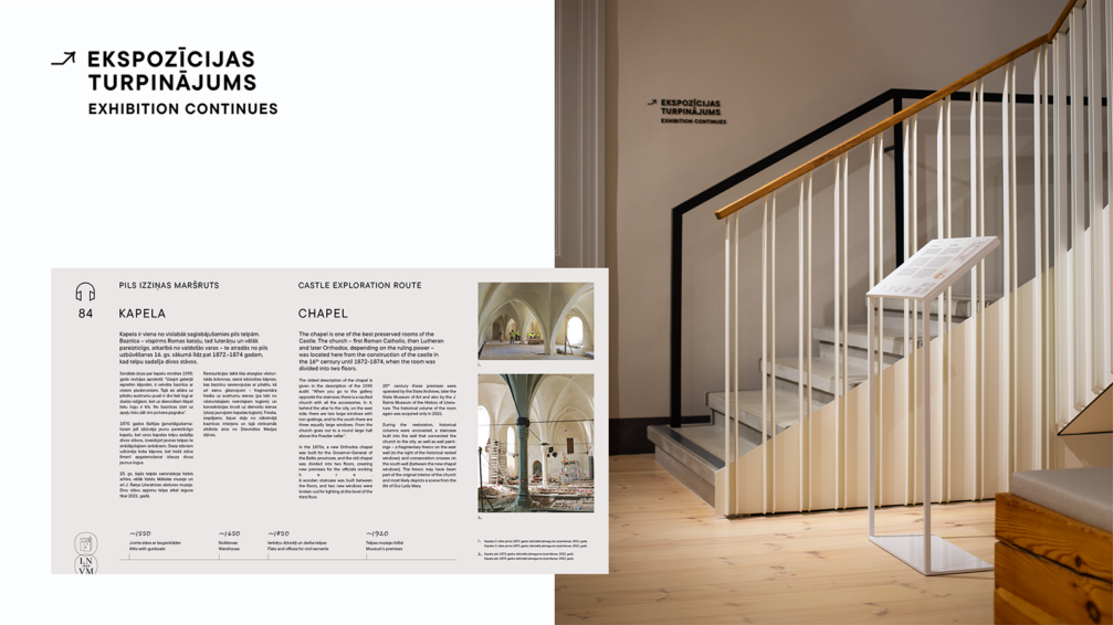
The concept of the visual identity is centred on time, its tangible and intangible nature. As Kid Design explains, we often perceive the past, present, and future through lines and axes that indicate a point of reference, where we have been and where we are going. This approach is also used in the visual identity of LNVM, with elements symmetrically placed on the axes dividing the space, both structurally in compositions and quite literally, using the axes as a visual element. The identity also includes references to the arches and vaults of the museum’s headquarters, the Riga Castle.
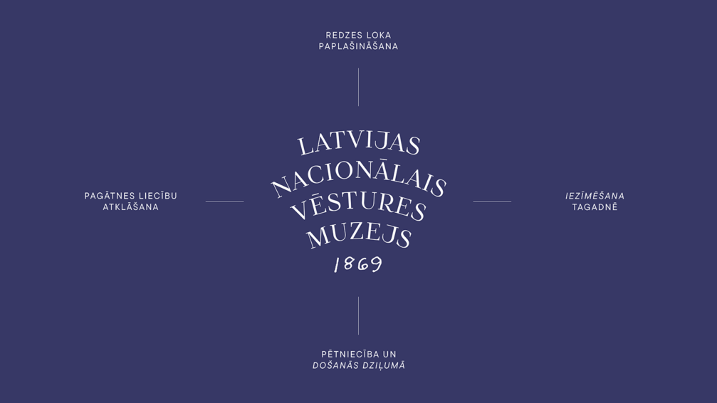
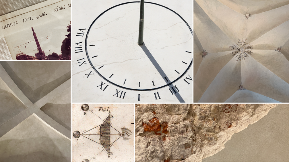
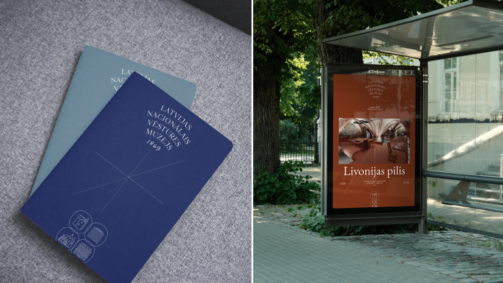
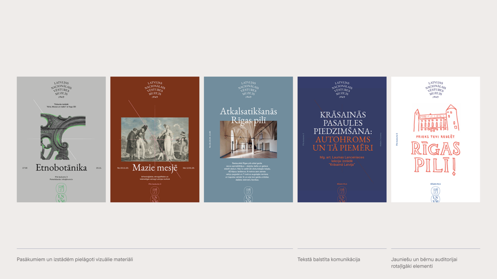
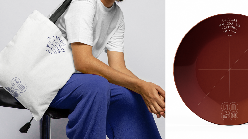
The visual identity is composed of three main parts: the wordmark, the system of symbols of LNVM’s locations, and the principles of symmetrical composition. The wordmark of the museum’s name is arranged in four lines, representing the four locations of the museum, with a complementary element — a handwritten year of the founding. This detail creates a link with the research process of the museum and stylistically creates a lively and humanly warm character. The narrow-angled shape of the wordmark is a metaphor for the research process, the discovery of heritage, the capturing of the passage of time, and the broadening of horizons. The idea of expanding the public’s views is manifested in many ways: in the broadening of the museum’s fields of activity and, through it, in the diversification of the public’s cognitive process, the creation of a diverse museum offer, and communication.
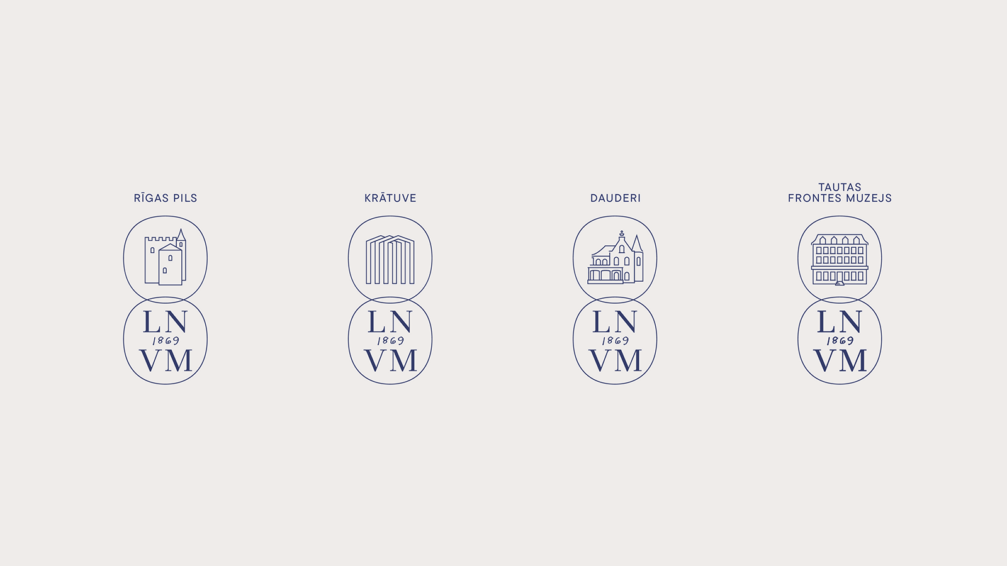
The symbols for each of the museum’s locations are based on the elements that represent value — seals and coins. For each department, Kid Design has created their own seal, which is accompanied by a shared seal of the LNVM, forming a continuity with the previous LNVM mark. When used together, the seals enhance the image of the museum as a single institution; while used separately, each seal highlights the uniqueness of every museum location and its building.
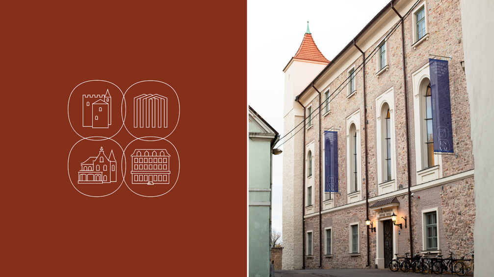
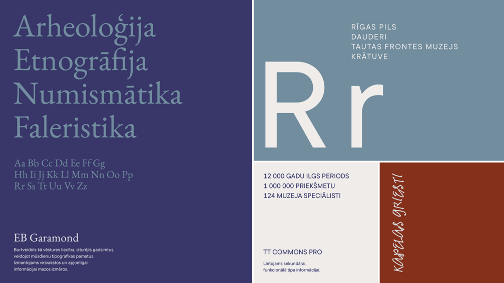
The symmetrical composition used in communication is an essential part of the unified identity. It not only refers to the basis of the concept — the passage of time — but also provides a clear framework for identity users and future material creators. The elements, typefaces, and colours used in the identity have been chosen to emphasise the importance of continuity. By choosing Garamond as the main typeface, Kid refers to the beginning of the development of modern typefaces. In the identity, Gramond is complemented by the clean and modern TT Commons typeface, creating a stylistic counterpoint that symbolises the importance of the past in shaping the future.
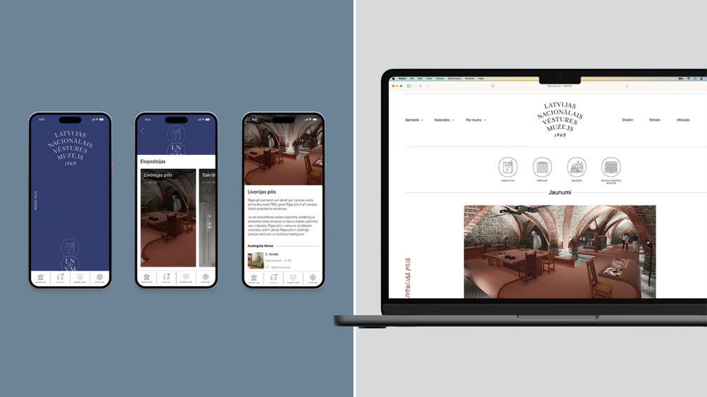
The new visual identity has been created in anticipation of the opening of the LNVM exhibition in Riga Castle in early 2025. In the meantime, the new graphic identity can be viewed on the LNVM website. You can follow the creative endeavours of Kid Design on the studio’s website and Instagram account.
Viedokļi