At the end of May, the NAPA Baltic Packaging Awards took place, which select the best packaging designs from all three Baltic States each year. Design studio Kid Design won three prizes in the competition: the packaging for the collector coins of Latvijas Banka won silver, while the packaging for Livo cocktail syrups and Just Nature products won bronze.
Latvijas Banka
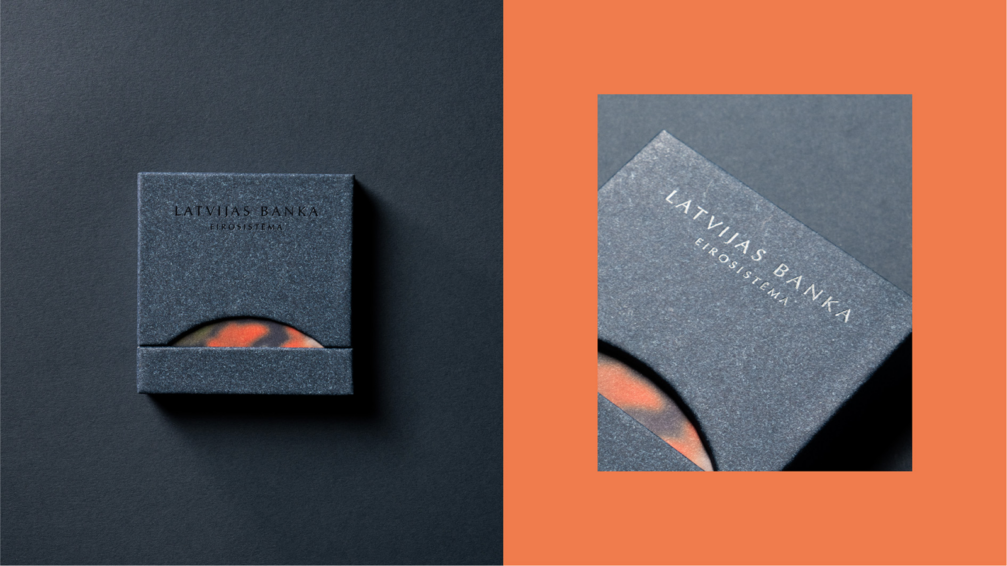
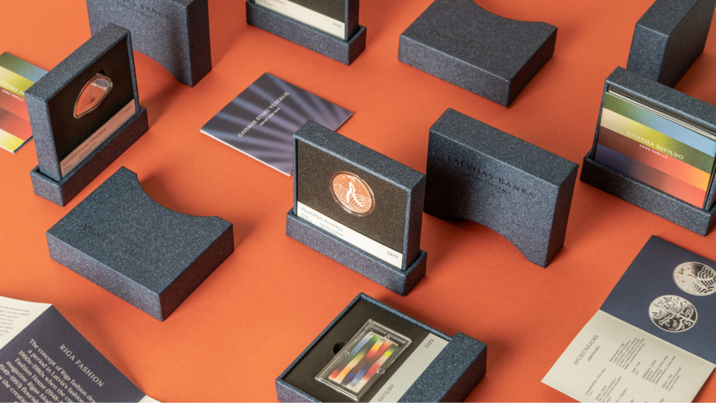
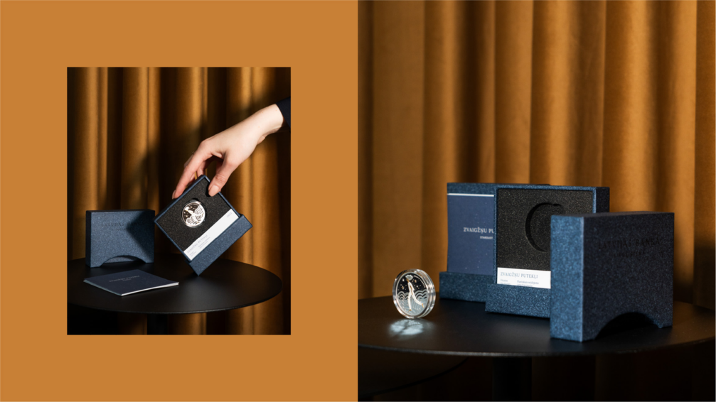
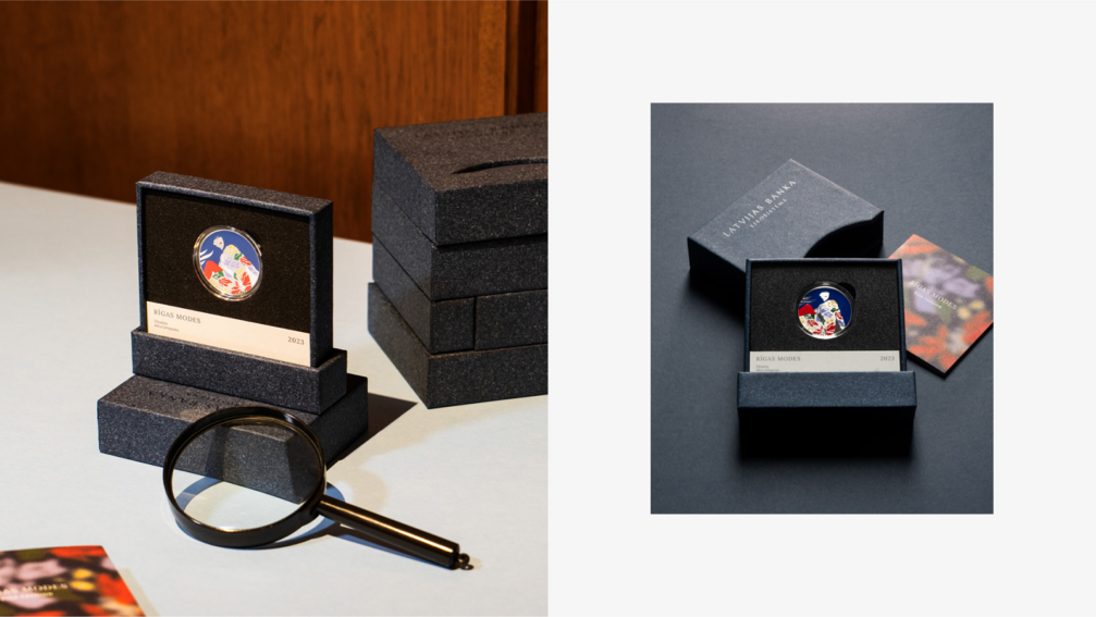
For years, Latvijas Banka (the Bank of Latvia) has used packaging for their collector coins that was taken from the jewellery world — a padded flip-box. The aim of Kid Design was to create a new form of packaging that complements the contents and is attractive, elegant, and functional. The solution is a sturdy cardboard box covered with distinctive design paper in the brand colour of the bank. At the front of the cover, a cut-out in the shape of a rising sun that is derived from Lavijas Banka’s logo helps to differentiate between different coins, as the brochure with the motif of the coin design is seen through.
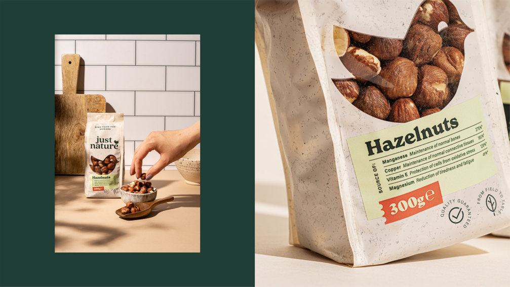
Just Nature
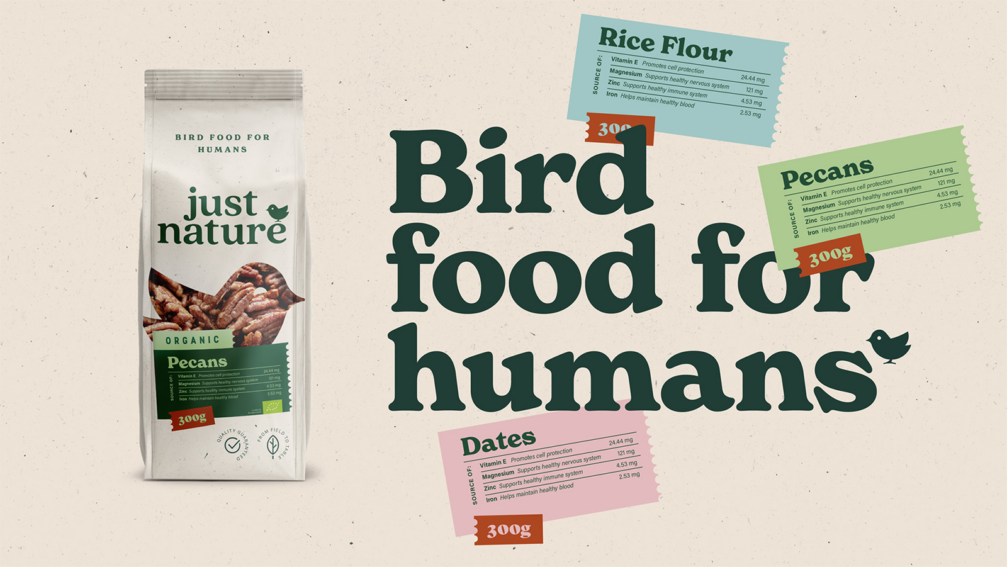
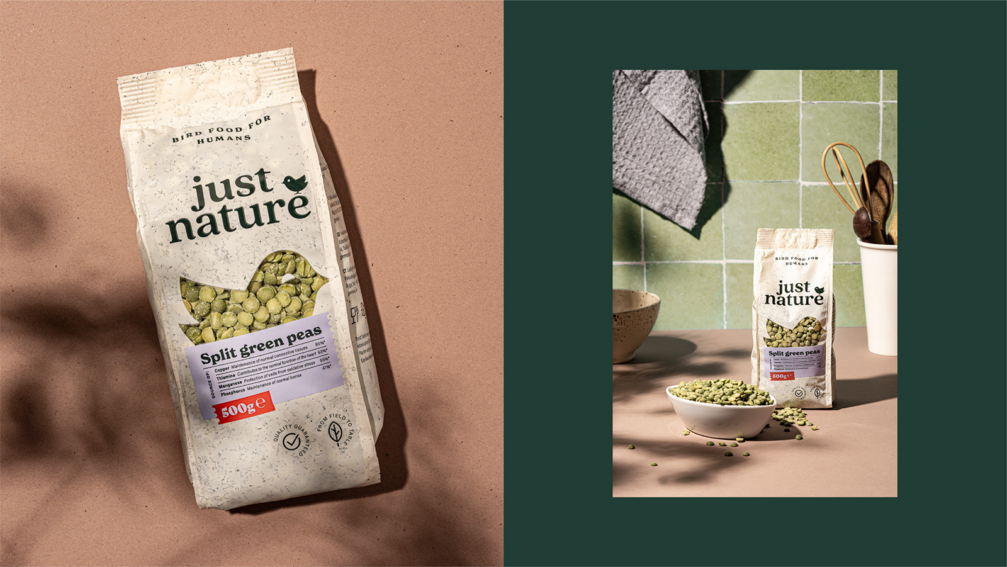
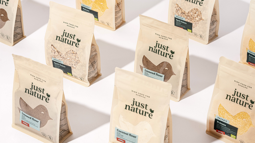
Kid Design’s concept for Gemoss’ export brand Just Nature plays on the joke about vegetarians, who mainly «eat bird food». The slogan «Bird food for humans» and the design message were created following this joke. The bird-shaped window allows the product itself to inform the consumer with its texture and colour while eliminating the need for a separate product image. The brightly coloured stickers with the product names help to distinguish between the different types of products and also provide a clear overview of what is most important: the nutritional value. The stamp shape of the stickers conveys the diverse origins of Just Nature’s products, while the seemingly careless style of the labelling shows the human presence in Just Nature’s «bird food» supply chain.
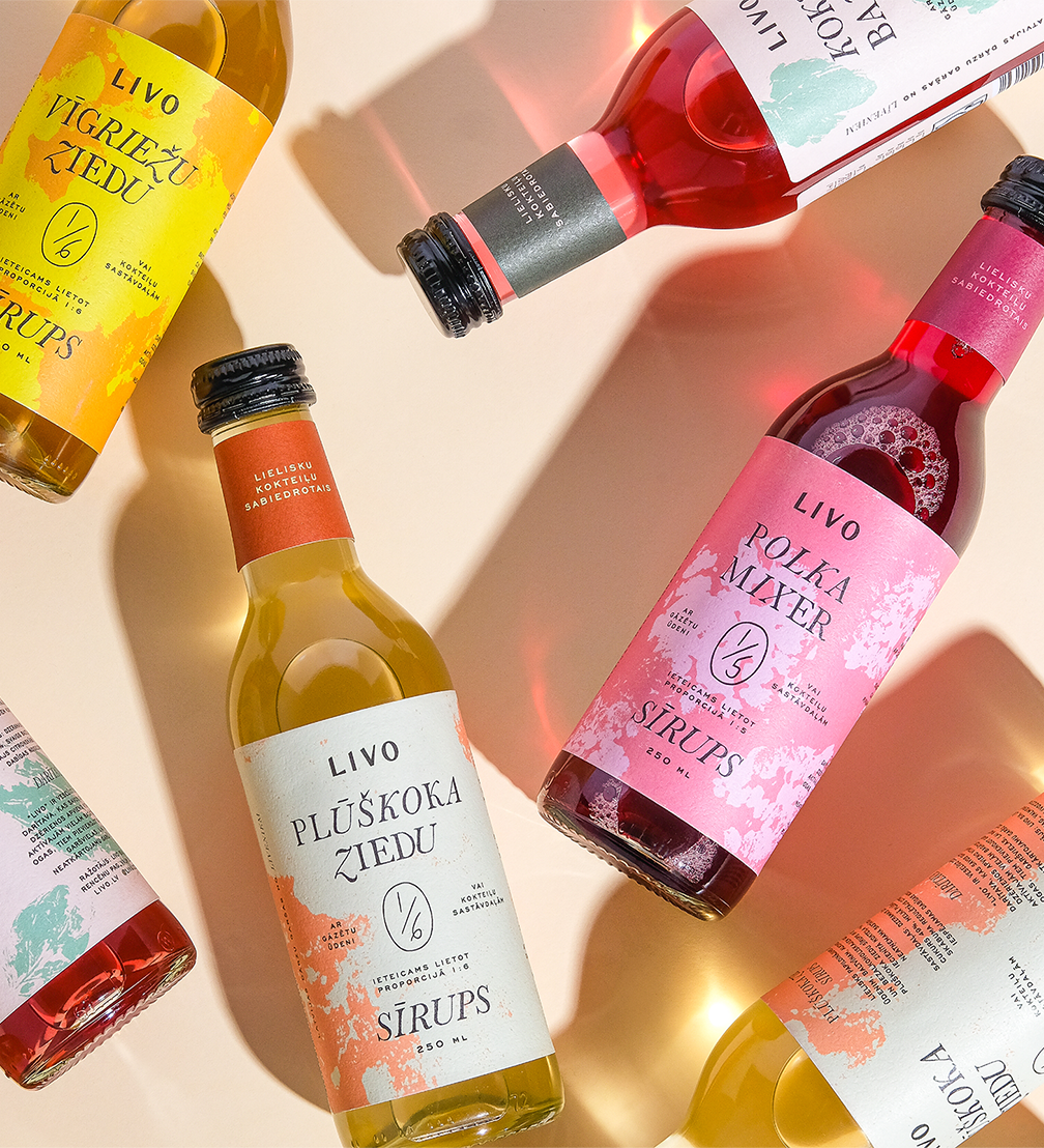
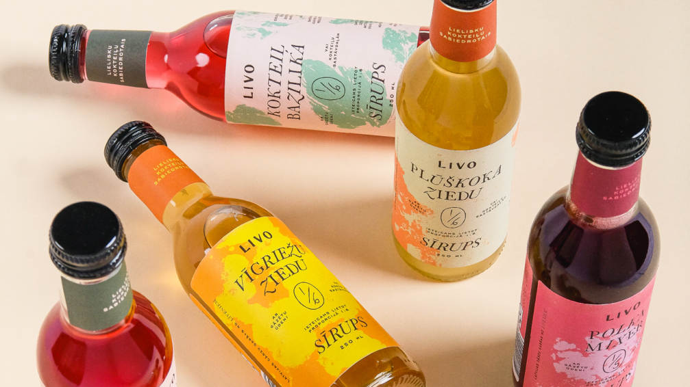
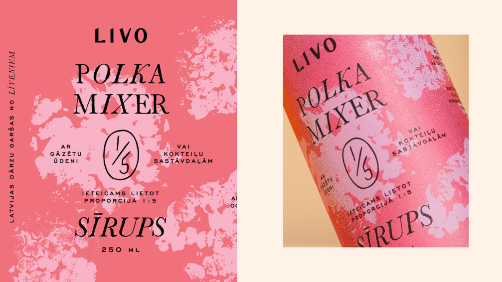
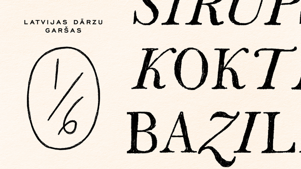
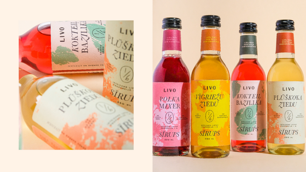
Livo
The small, family-run business Livo creates syrups that can be used to make excellent cocktails. The patterns on the labels are custom prints that were made using berry and herb leaves. The colours of the labels represent both the joyful moment of enjoyment and the taste experience to come. The carefully chosen and designed letterforms strike a balance between the image of a small home producer, the lightness of non-alcoholic beverages, and the sophistication of alcoholic cocktails. The Livo packaging design was created as Kid Design’s annual barter. Every year, the studio creates a packaging design for a small food producer in Latvia in exchange for their products that Kid Dsign gives to their clients and partners for Christmas.
Vairāk par «Kid Design» — studijas mājaslapā.
«NAPA Baltic Packaging Awards» iepakojuma dizaina konkurss šogad notika jau desmito reizi. To rīko Lietuvas dizaina asociācija (Lietuvos dizaino asociacija). Ar visiem 2024. gada uzvarētājiem var iepazīties konkursa mājaslapā.
Viedokļi