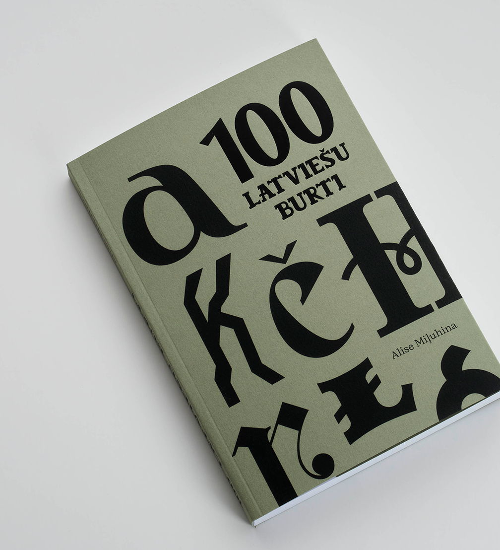
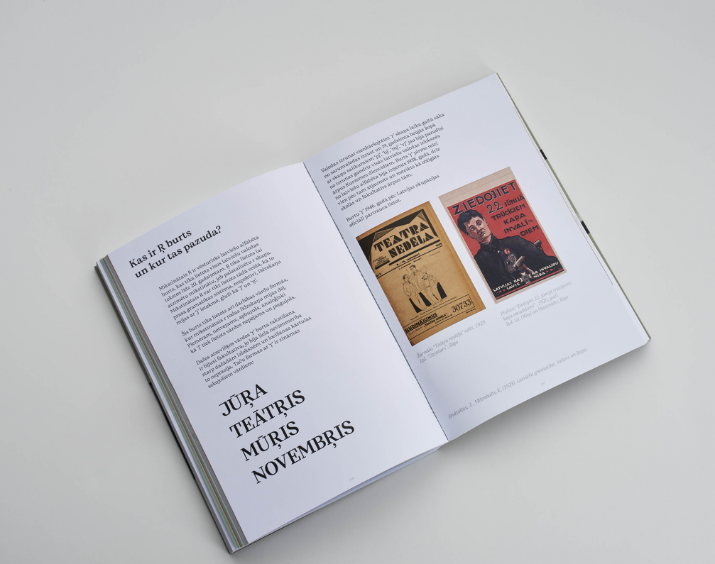
For her bachelor’s degree project in the Design Department of the Art Academy of Latvia, the young graphic designer Alisa Milyukhina focused on Latvia’s typographic heritage, compiling the most interesting and significant findings in the book 100 Latvian Letters. It contains a hundred letter samples from various sources, spanning from the 1890s to the 1970s, offering insights into Latvian design history while also serving as a personal collection of observations made by the author while searching for the Latvian essence in letter art.
Alisa was prompted to explore Latvian typography due to the scarcity of available information on this topic and Latvian design history in general. She points out that letter design is not just a communication tool but also carries culture — as the historical situation, public sentiment, and taste changed, typography has evolved along with them. «My goal was to gather various items hidden in libraries, archives, museums, flea markets, second-hand shops, as well as people’s private collections — things that were found in the’ mailboxes, kitchens, wallets, and bookshelves of Latvians. I wanted to tell the public how diverse, rich, and resourceful Latvian design has been,» Alisa explains.
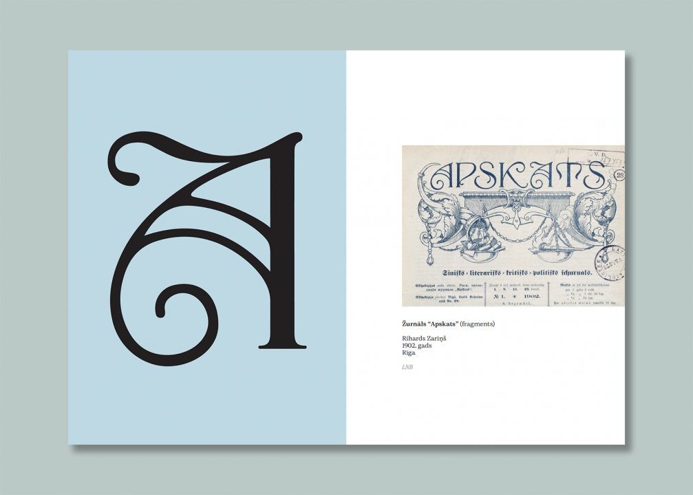
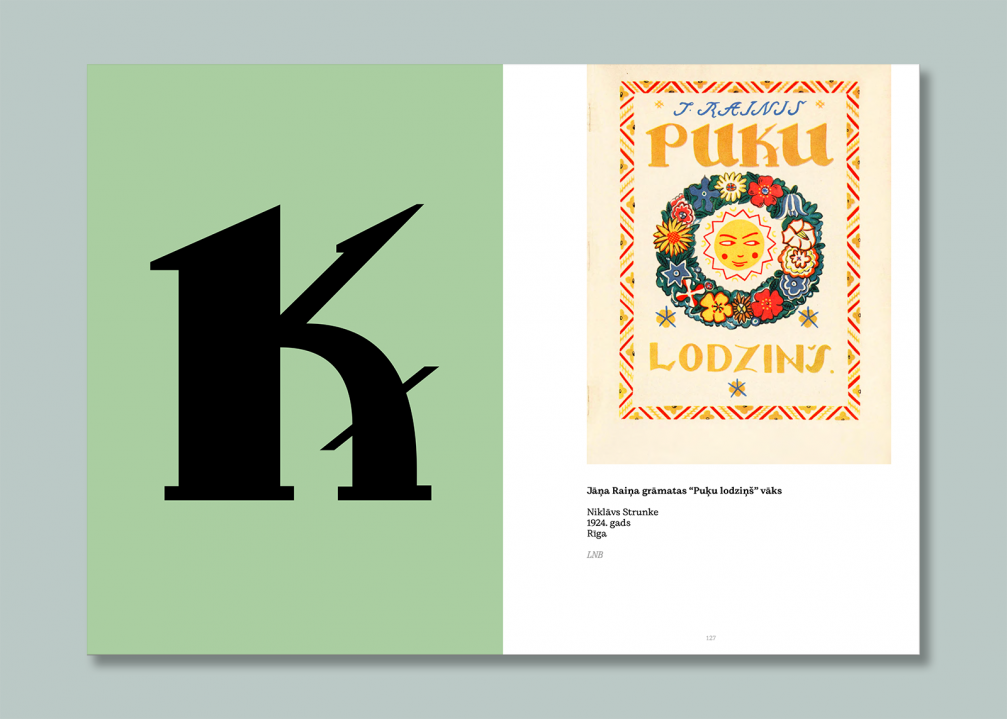
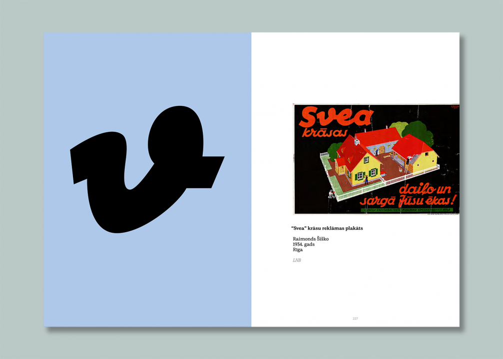
After looking at more than two hundred periodicals, about a hundred packages, and countless book covers, Alisa selected a hundred different letters she liked the most. To help readers better navigate the book, the designer created a system where each decade is assigned a colour. For example, the 1920s are highlighted by a green shade, and letters from this period are printed on backgrounds of this specific colour. The book also provides information about the authors of the letters, showcasing the most influential graphic designers and complementing them with brief texts about the authors and their most distinctive styles. There are also sections about changes in the written language — when and why diacritics appeared in the Latvian language, when the letter «ŗ» disappeared, and why Latvians abandoned «old print»? Alisa notes that these changes are primarily viewed from a visual, rather than a phonetic, perspective.
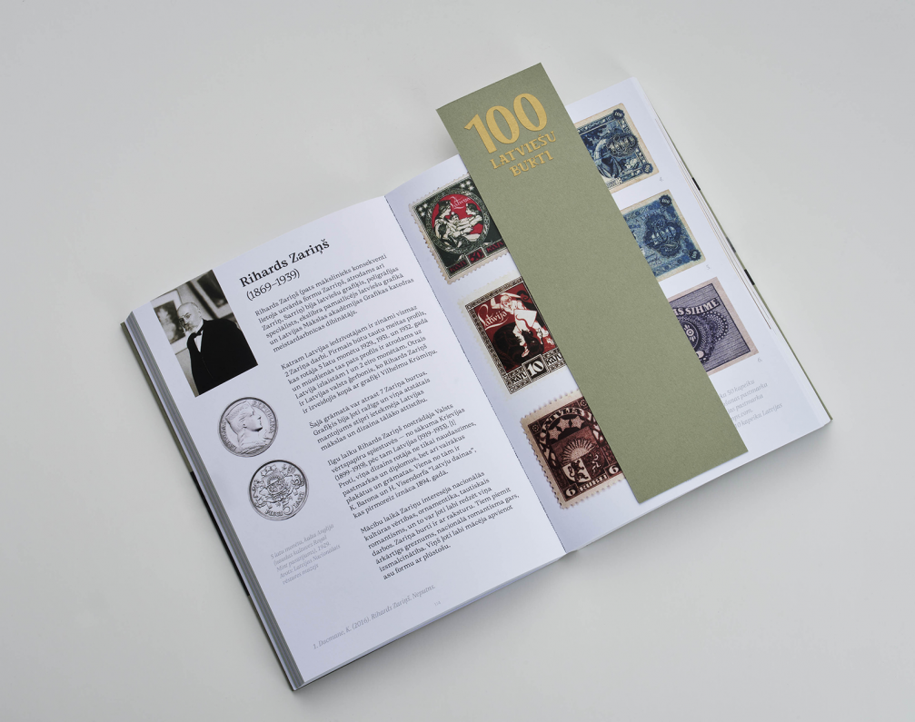
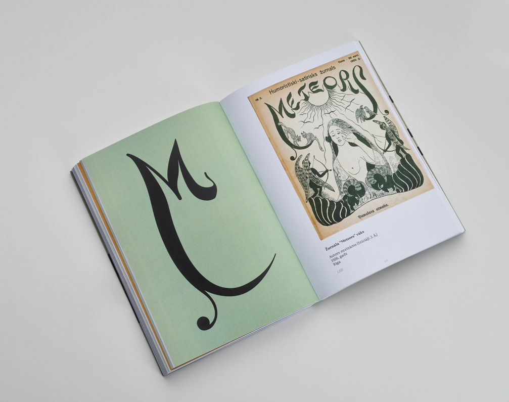
Working on 100 Latvian Letters is also personally significant for Alisa: «The intensive research into Latvia’s design heritage, periodicals, art, and literature meant a lot to me. I not only learned many new things about outstanding Latvian graphic designers but also delved into the orthographic reform process, Latvian history, and culture. I come from a Russian-speaking family, attended a minority school in Jelgava, and have always had a slight crisis of national identity — can I call myself a Latvian? Can I write about the Latvian language if I’m neither of Latvian nationality nor a linguist? After the book came out, I realised that I have every right to call myself Latvian, even if someone disagrees. This is also my country, and I am and want to be part of our culture.»
The first edition of 100 Latvian Letters, which was created as part of Alisa’s bachelor’s thesis at the Art Academy of Latvia, was very small — only 30 copies. They were sold out even before Alisa presented her thesis. The second edition of the book will be released soon, and it can be ordered on Alisa’s website. This project has inspired the designer to continue working on Latvian design heritage. Currently, Alisa is working on a typeface based on the cover design of Aleksandra Dzērvītis’s book Latvju Raksti, published in 1973 in Toronto. The letter design used for the title on the cover of 100 Latvian Letters also originated from that book.
Alisa’s bachelor’s thesis supervisor at the Art Academy of Latvia is Maija Rozenfelde. You can follow Alisa’s creative journey on her website and Instagram account.
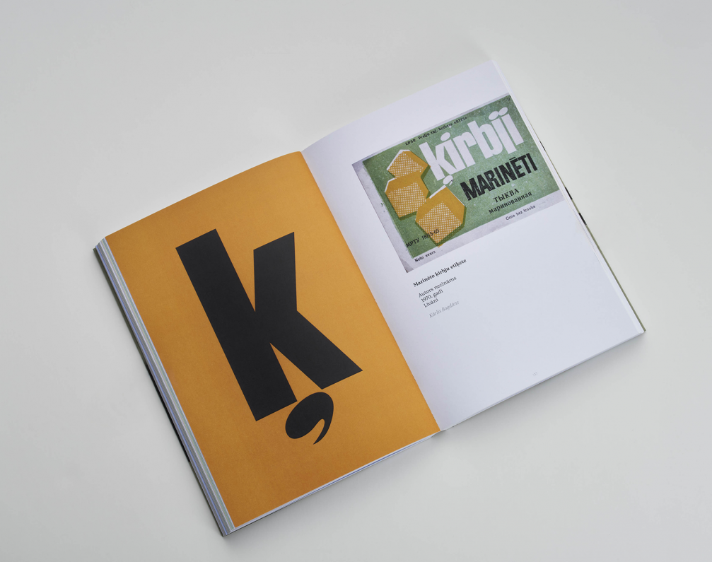
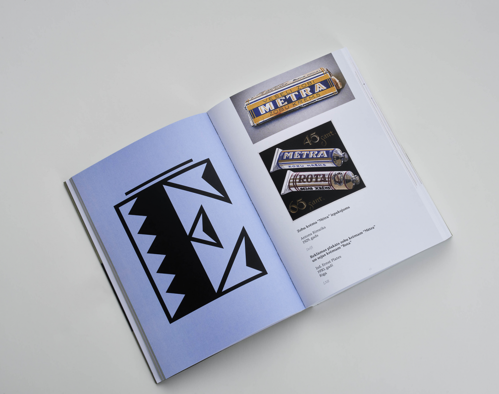








Viedokļi