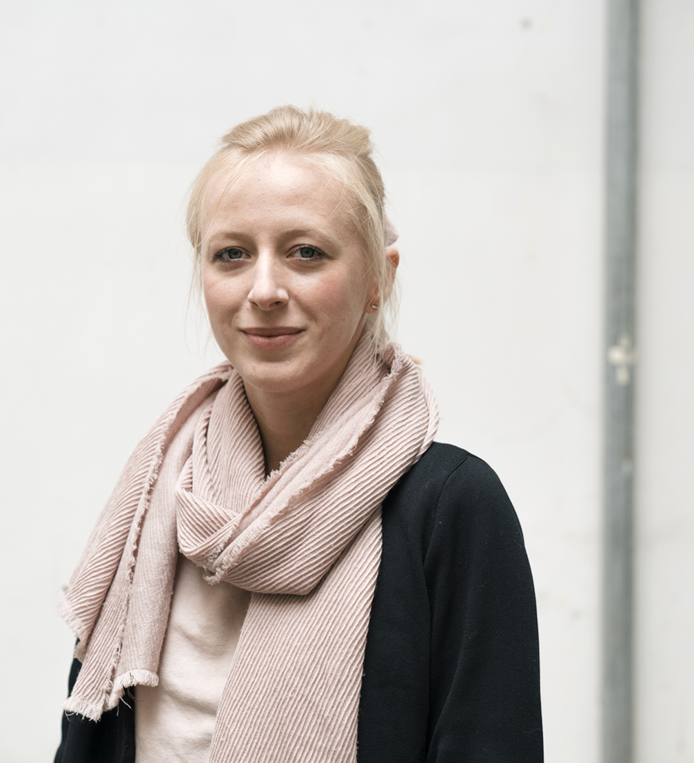
Graphic designer, publisher, and curator Magdalena Heliasz is an expert of the Polish graphic design scene. In 2011 she created Print Control — an online platform and annual magazine for promoting Polish design through publishing, exhibitions, and cultural events. In these eight years she has been seeking out the best examples of graphic design and building a comprehensive collection of works.
Magdalena Heliasz was one of the invited speakers at the conference «Workflow. Conversations on book design and publishing», organised by the platform Latvian Literature in Riga.
You are the creator of Print Control — a platform for promoting Polish graphic design. How did it begin?
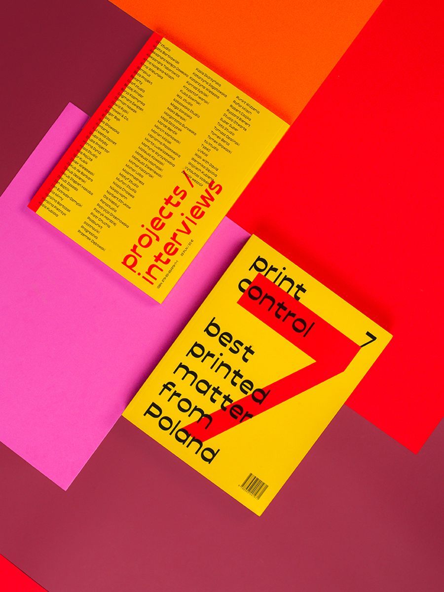
I started to write a blog about Polish graphic design when I graduated from the Academy of Arts in 2011. Print design was starting to get popular and there were interesting examples already but they weren’t collected in one place. Soon everyone was becoming enthusiastic about the blog, especially graphic designers. A year and a half later I contacted an institution that promotes Polish culture abroad — the Adam Mickiewicz Institute. Together we decided that we could print the content of my blog in an annual magazine. On the internet, you can collect everything but when you’re scrolling and scrolling, somehow it disappears somewhere. So I thought it would be better to document it on paper to last longer.
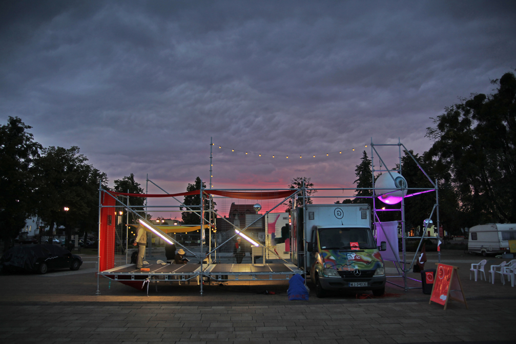
This December we are going to publish the eighth issue of the magazine and it will focus on illustration. Every issue has a theme and the content is divided into two main sections — the first part focuses on printed graphic design and the second is made up of interviews with graphic designers. For instance, the theme of the fifth issue was cooperation, and we interviewed graphic designer Jakub de Barbaro who together with friends decided to make a gallery in a van. They drove through Poland and set up exhibitions in little towns. I found it very moving because they did it mostly in places that don’t have any cultural institutions. I think, this is a good example of how graphic designers can cooperate in different fields and work for the benefit of people who are not in any way close to art or design.
Apart from the Museum of Posters in Warsaw, the Association of Graphic Designers STGU, a little design gallery BWA in Wrocław, and a couple of design festivals or conferences in Poznań, Gdynia, and Łódź, there are no museums or any other national institutions that would promote the work of graphic designers and educate the general public about visual communication. There should be more initiatives to inform the society about the importance of the visual aspects of public spaces and the work of professional graphic designers. Unfortunately, they are often not invited to take part in the design of new spaces or renovation projects.
How exactly does the Print Control platform operate?
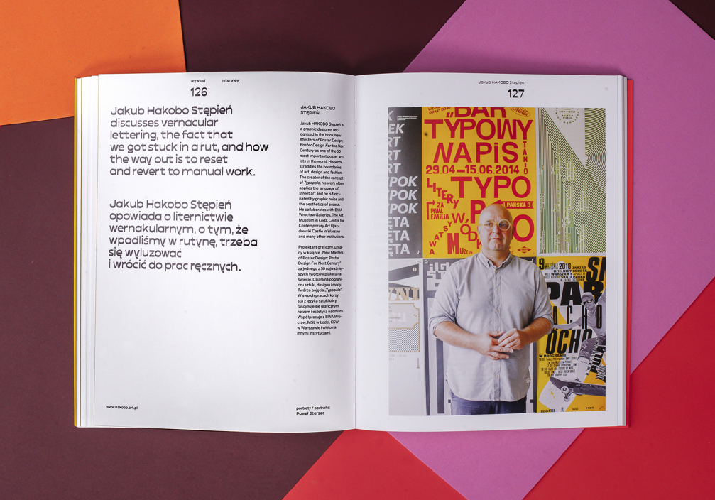
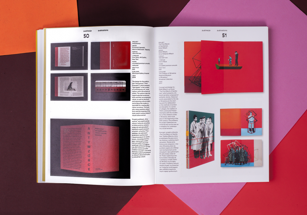
My job is to constantly follow what is going on in the Polish graphic design scene. Once a year I put an open call online, so designers can send in their projects as well. Afterwards, I try to make a selection of 100 projects. For the printed issue, I divide them into three categories: posters, publications, and identities. Obviously, my actual goal isn’t to divide them into three sections but to find the widest range of graphic designers in Poland. I try to include examples from various cities, not only from Warsaw. I am not a historian of art or design and the shortlist is my personal selection but I try to be fair. I really hope that this collection will be useful in the future.
What has changed in the Polish graphic design scene over these eight years while you’ve been running the platform?
After the publishing of each issue of the magazine I organise a small exhibition where graphic designers can come together — it’s a social thing. What I remember from the first exhibitions — people were really excited and I thought back then that the socialising of professionals is really important. Today there are many more initiatives and festivals, and workshops held in Poland.
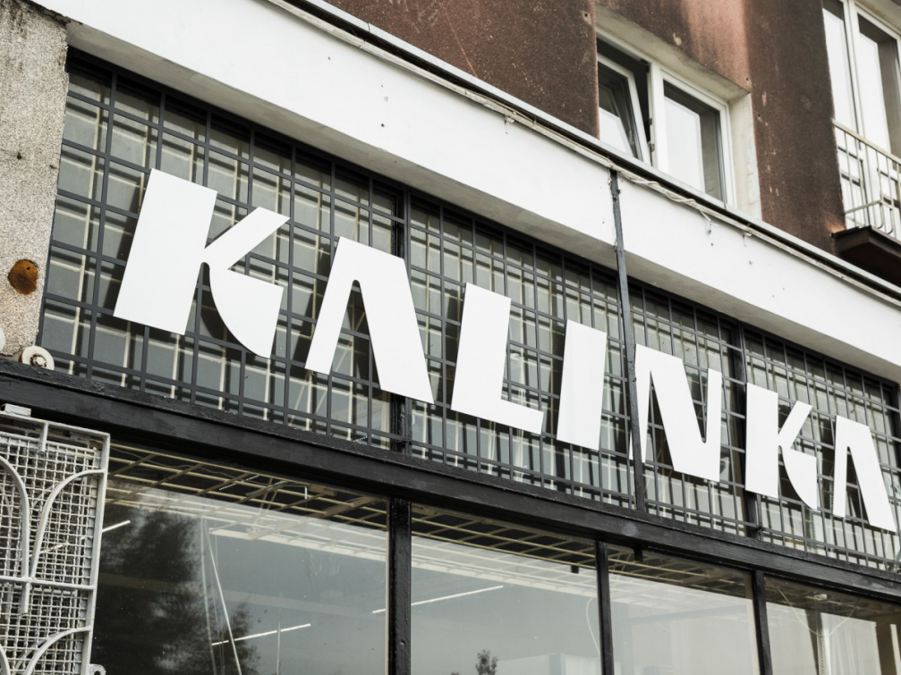
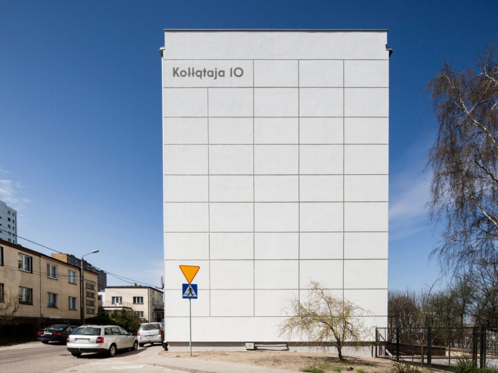
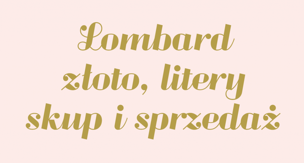
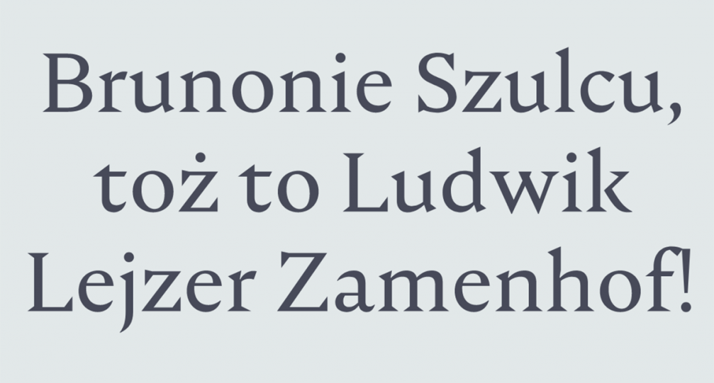
In terms of print design, in the beginning graphic designers were a bit timid but they were really looking forward to experimenting. When designers realised that there’s a whole bunch of different technologies and papers, and different bindings available, they were so eager to use them that in some cases they overdesigned things. Now graphic design is becoming calmer and designers use the technique that is appropriate for the project, and are more thoughtful about their choices. The Polish graphic design scene is still developing. Designers are looking for inspiration in the past while trying to find their identity. Some graphic designers in Poland are focusing on their local environment. That wasn’t so common before because they were more fascinated with what was trendy abroad, especially in the West. There is a group in Gdansk called Traffic Design that is trying to revitalise the city — they are refurbishing the facades of buildings, and signs. Also, an independent typography project was held in Warsaw — Warsaw Types / Warszawskie Kroje — as a result of which a series of twelve new typefaces was created based on the old lettering, signage, neon signs, and shop windows that are disappearing from our capital.
In your opinion, what are Polish graphic designers the strongest at?
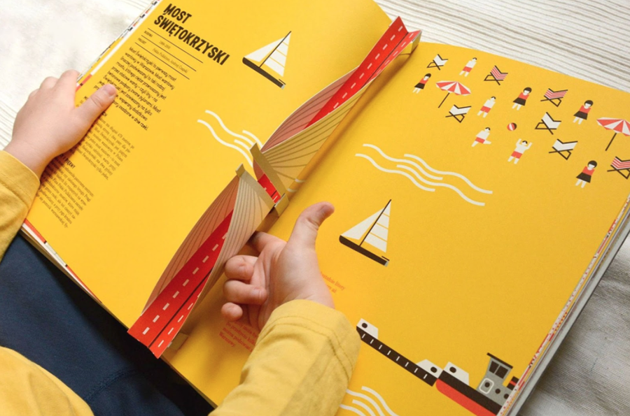
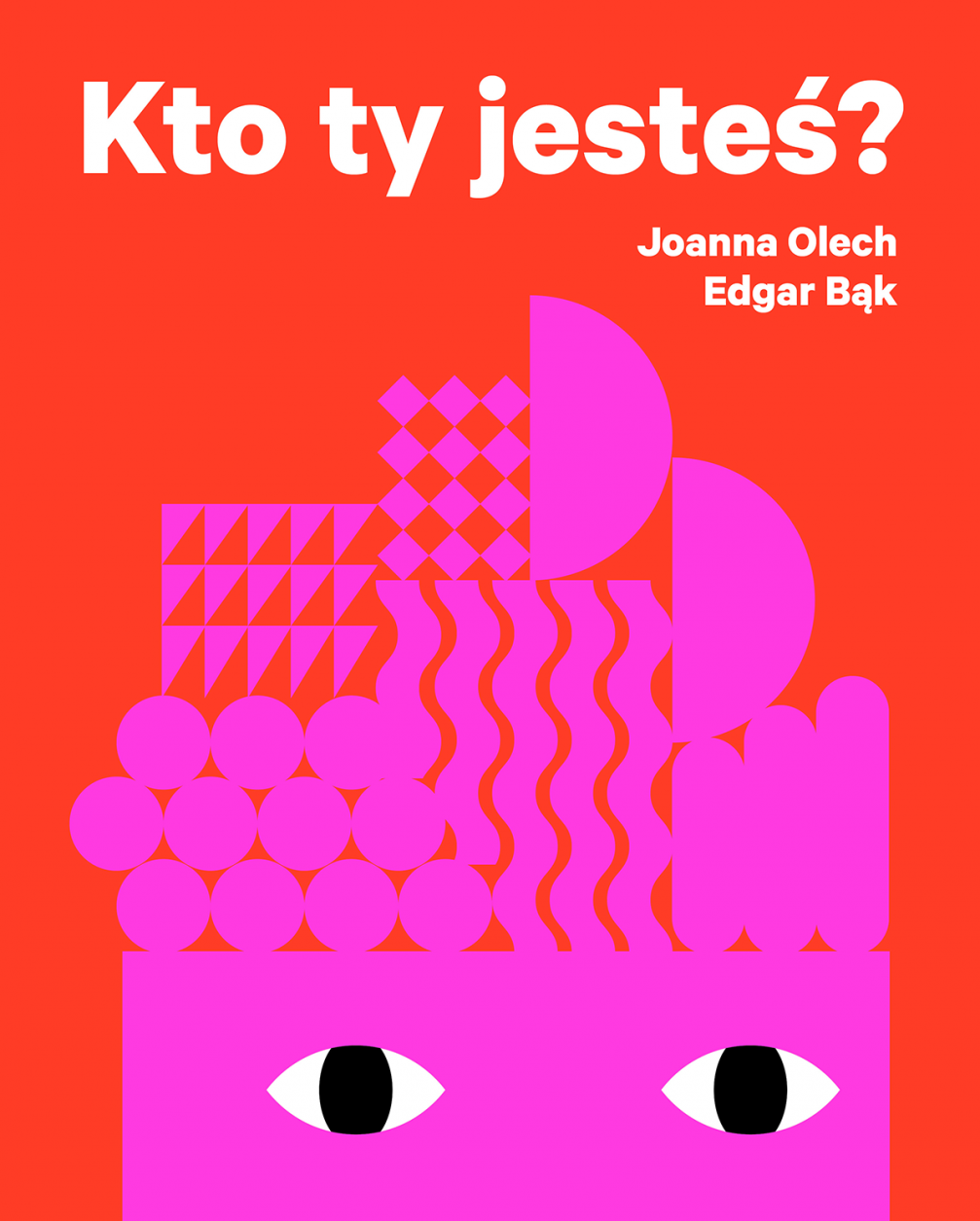
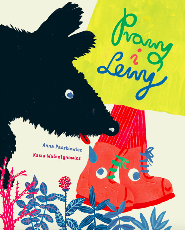
Illustration is a very strong part of Polish design, especially illustrations for children. There are a lot of books that have won international prizes, for example, in the Bologna Children’s Book Fair. Publishers such as Dwie Siostry, Wytwórnia, Muchomor, Widnokrąg not only adapt books from abroad, they also work with local illustrators and create original content. The other field is more independent — Polish photographers work in a close collaboration with graphic designers to create photobooks. These are usually limited editions. This year «Echo», Maksymilian Rigamonti’s photobook designed by Kasia Kubicka won the title of Photography Book of the Year 2018 at the prestigious competition Pictures of the Year International.
I’ve read that posters from the 1920s to Polish design are what sushi is for Japanese cuisine — they are essential. Are young designers interpreting the old posters today?
Oh, yes, those posters are the thing. This field of graphic design used to be the most known and appreciated not only in Poland but also abroad. The style of Henryk Tomaszewski, the father of the Polish School of Posters, was mainly based on illustration with some playfulness and humour. I think that’s why a lot of projects now feature type design that is created in an illustrative way. Some designers continue this illustrative approach while others consider it outdated. They want to build something new.
It seems that design often repeats itself. How can one find a unique voice in design?
Sometimes repetition is useful because you don’t have to reinvent the wheel. For example, if I go to another country and I need something from the drugstore, I know, more or less, on which shelf this thing will be. It makes some parts of our lives much easier. But in the creative field we lack uniqueness. I think solution to this problem could be found in history and local heritage. But, at the same time, being local is also a trend everywhere now.
What are the biggest challenges in your work as a publisher?
It is to fit the work of Print Control in my regular schedule, I think. Print Control is not my main job, I make my living as a graphic designer — I mostly design books.
You are also a co-organiser of the Warsaw Art Book Fair. Why is it important to hold such an event?
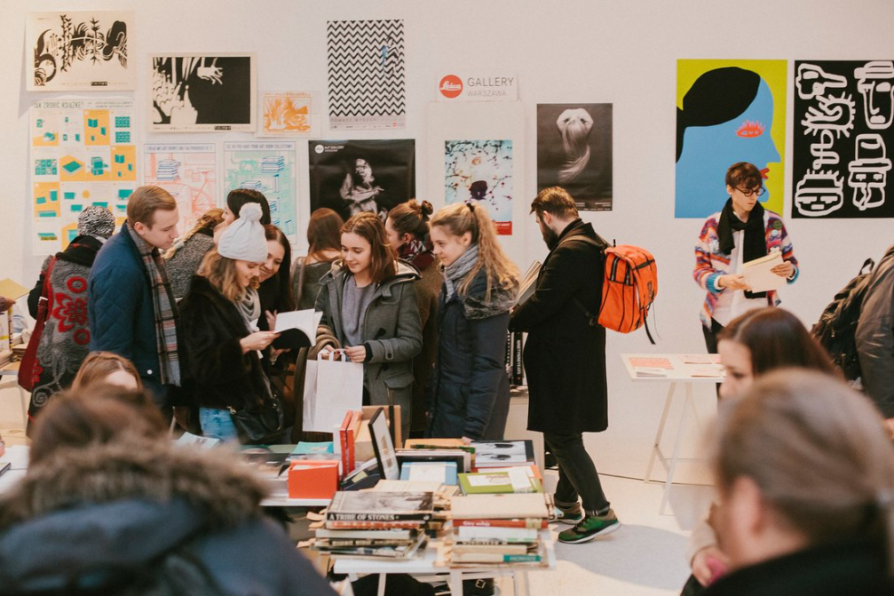
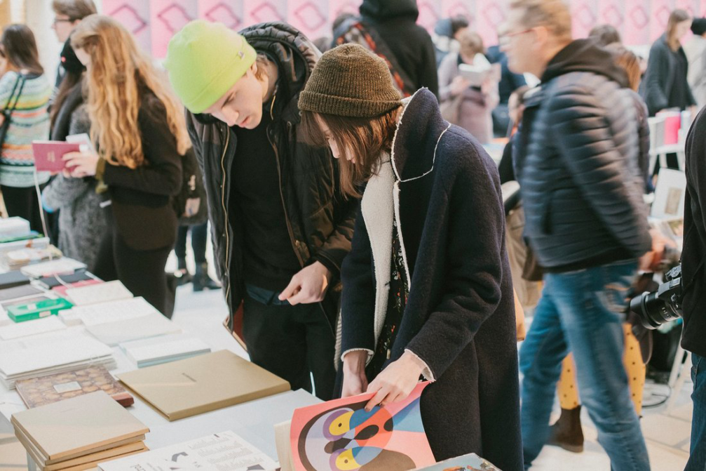
There were various independent book fairs in other cities — Poznan, Krakow, but we didn’t have one in the capital city. Four years ago the owner of the art bookstore Bookoff in Warsaw asked me to help to organise a book fair, and in cooperation with the Museum of Modern Art in Warsaw we created the first Warsaw Art Book Fair. It was a success, and in the next year we did another addition. It is important to build a community and to continue to develop it. The book fairs are always accompanied by various events, such as exhibitions, workshops, talks. It is a great place for making new connections — authors, illustrators, graphic designers, photographers meet each other and can start new projects. Our future plans include gathering more publishers from Eastern and Central Europe.
You manage to do a lot — running the main platform for Polish graphic design, working as a graphic designer, co-organising book fairs. I’m wondering — how do you fit all that into 24 hours?
Perhaps, not everything that I do is perfect but I’m a hard worker. Sometimes I overestimate what I can fit into my schedule. I might be an example of how the Polish design market works. We are still a developing country and we still have to work hard to upgrade our state. If you look at Warsaw — the rhythm of the city is very fast, everyone is in a hurry. The cars are parked the wrong way because people need to do things quickly — get out and back in. In the city the attitude towards any other people is still quite rough and that’s because we have to work a lot, and everyone is tired.
What inspires you to work so hard?
In terms of my personal work, meeting other people gives me the energy. Every project is another story, and that’s how you get to know others and their attitude towards the world. Sometimes I think that graphic designers are a bit like therapists. When you’re working with a client, they have to express what they want, who they are, and how they would like to shape their image. Designers materialise other people’s ideas and that’s the inspiring side of the work. As a curator, my mission is to make Polish design great again, and I’m curious if it’s still possible to find things that can surprise me.
Viedokļi