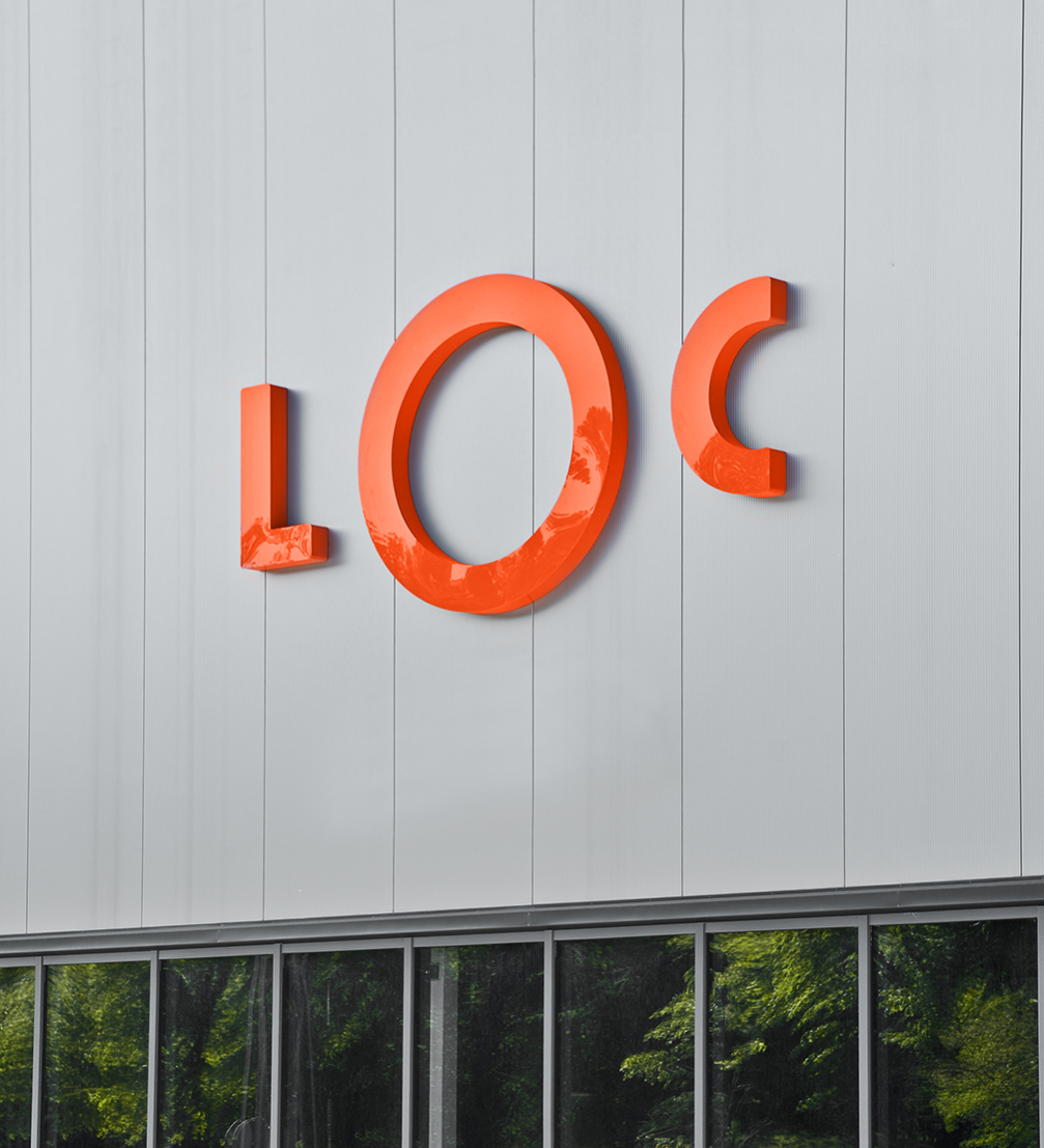
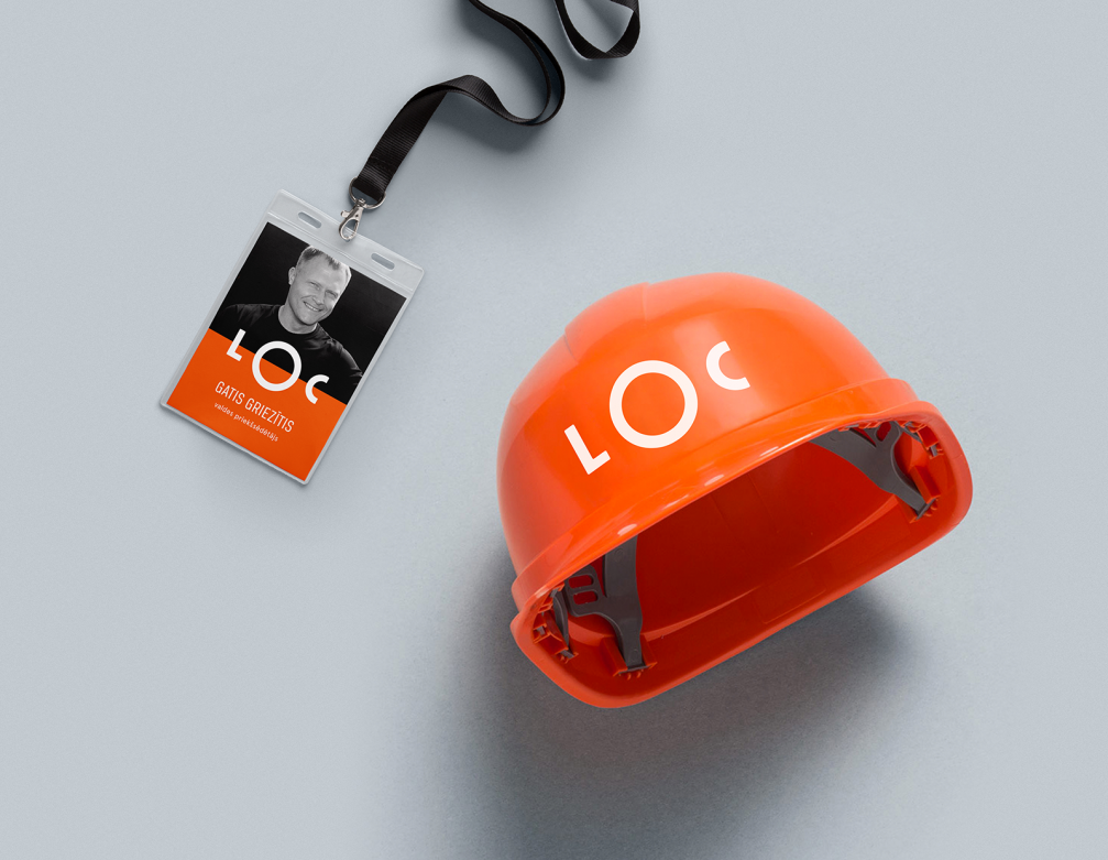
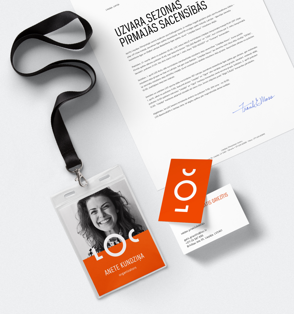
Last year, the Liepaja Olympic Centre (LOC) celebrated its ten–year anniversary. Before taking the next steps toward the company’s development, a new visual identity was created by the brand design studio «Asketic», aiming to embody all of the centre’s diverse activities.
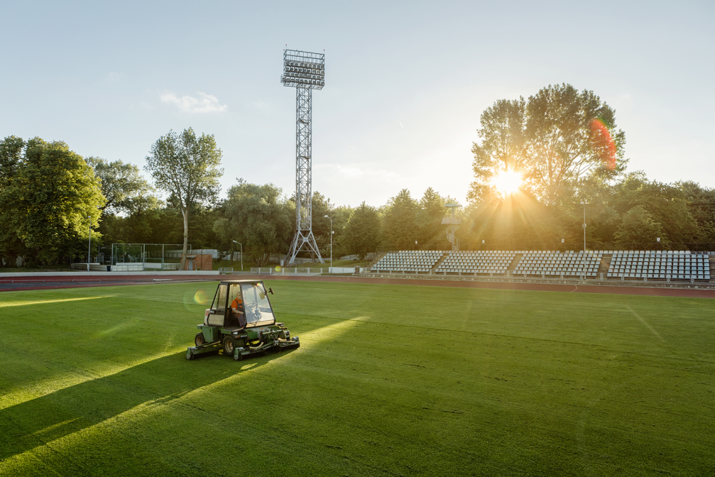
«Visual language is an important tool that allows brands to communicate their existence, values and visions precisely and concise. In our case, the previous identity was outdated and too restrictive because we have been much more than a specific area or physical building structurally and functionally for a while now,» the LOC marketing manager Mārtiņš Sīlis explains the reasons behind rebranding. Over the years, the LOC has become a whole sports infrastructure all over the city.
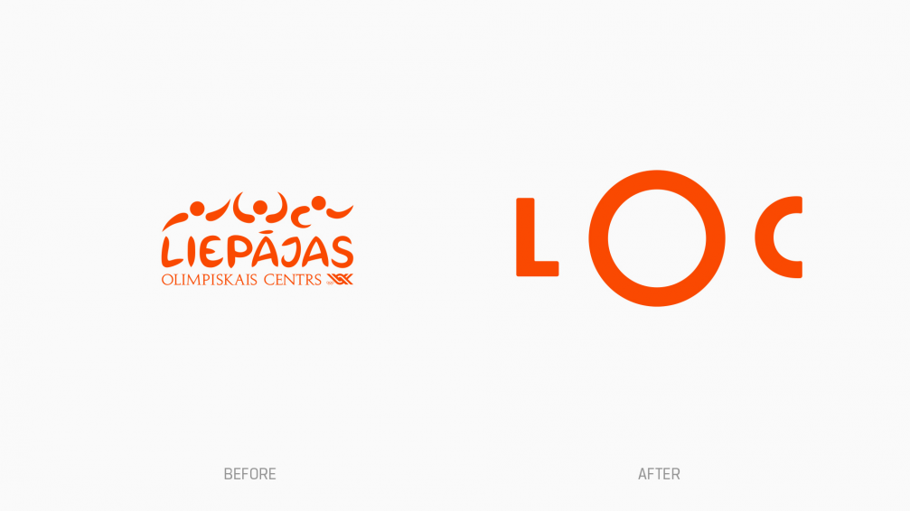
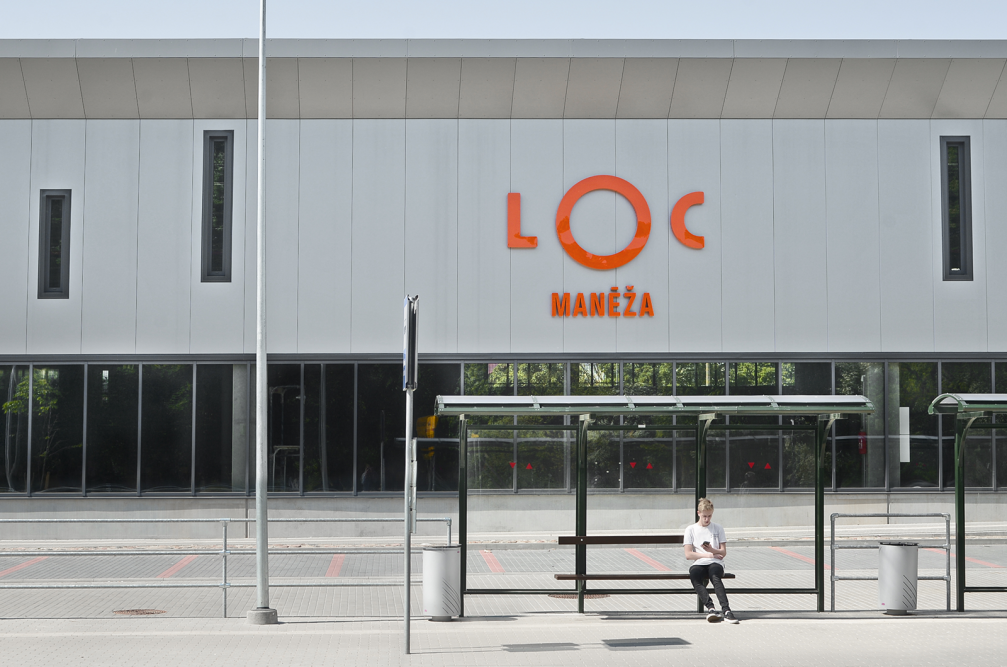
«The task of the new identity is to tell about all LOC objects, including the track and field athletics manege, stadiums, ice hall, tennis hall and others, in a clear and simple manner. The logo itself has a central composition to emphasize a united centre for all infrastructure and diverse activities,» comments designer, founder of the design studio «Asketic» Miķelis Baštiks. A monolith, laconic sign, based on the LOC abbreviation, has replaced the previous solution that consisted of various small and futile graphic elements. The new identity, however, preserves the brand’s characteristic orange colour, which also appears in the architecture and interiors of the sports facilities.
«In my opinion, «Asketic» has done a great job. They understood the essence of the LOC in a short time and found a meaningful and universal graphic language system that improves corporate communication in all directions. Moreover, the system is adaptable and is focused on development just like we are,» Mārtiņš Sīlis is pleased with the result and believes that when noticing the new visual identity somewhere in the city no one is wondering what it means.



Viedokļi