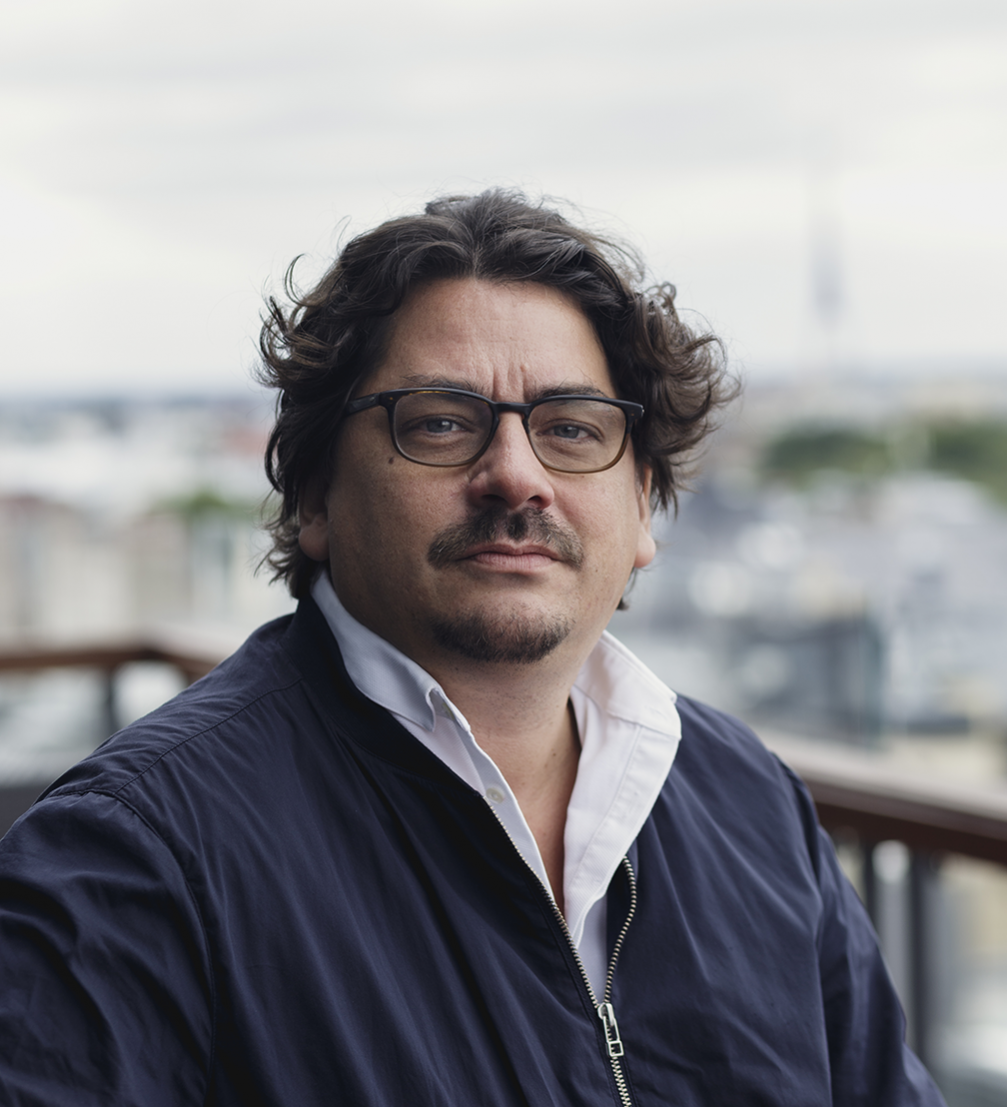
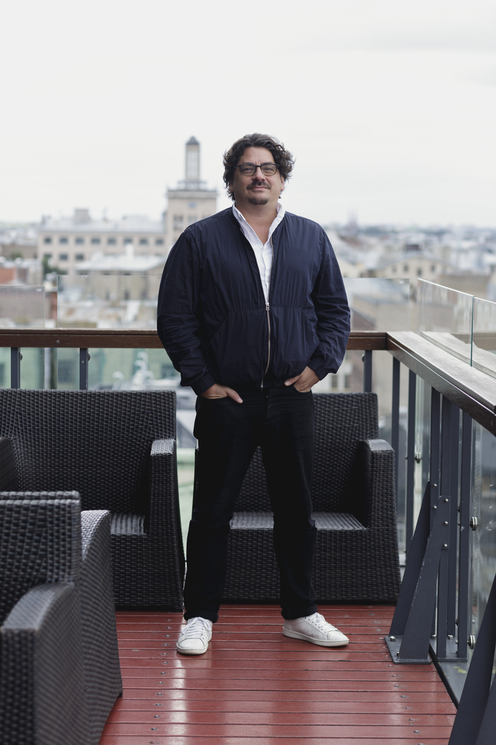
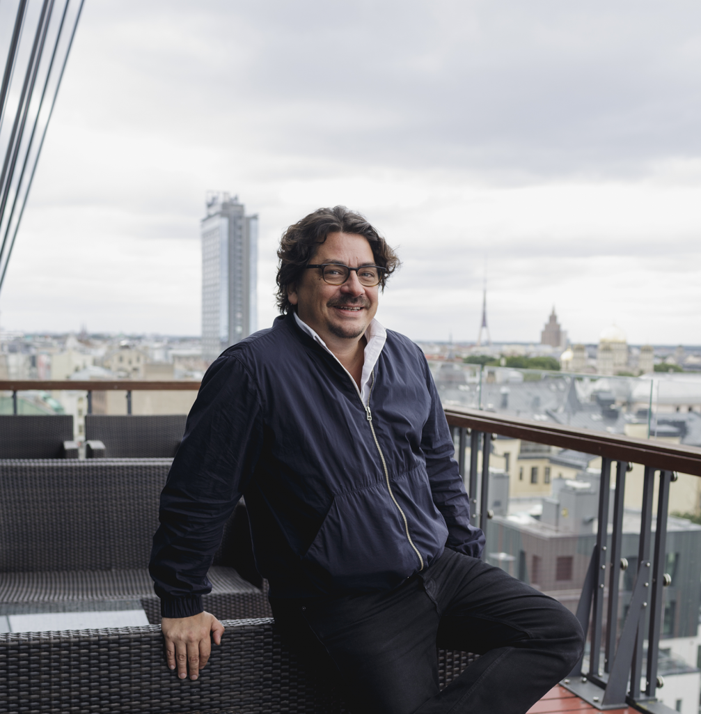
Thomas Kartsolis, the art director of the Munich–based magazine «Süddeutsche Zeitung Magazin», visited Riga as one of the jury members of the Festival of Creative Excellence «Adwards». He also held a lecture «Why you should judge a magazine by its cover». Thomas has gained a significant experience creating the visual image of 52 issues per year but still talks about his work with genuine passion. «Süddeutsche Zeitung Magazin» has received many awards. In 2016, it was announced the Best Magazine of the Year in Germany, while Thomas himself was nominated as the Creative Leader of the Year in 2015.
What is the most important element of a good magazine?
The cover! (Laughs) It is a problem for commercial magazines that in the fear of losing the readers and their money they are loaded with flashy titles, the women’s magazines have women’s names on them. It is boring. The good and serious issues don’t use tricks like that and I’m only happy that I’m not part of that. Working in the jury I saw your «Benji Knewman» magazine, I think, it is also available in Munich. It is a good standard. Quality always works.
You work at «Süddeutsche Zeitung Magazin» since 2012. Did you make any changes when you joined the editorial team?
Before that, I had worked with other magazines, published by «SZ», such as «Now», «Fluter» and «SZ Wissen». When I joined the «Süddeutsche Zeitung Magazin» I brought back more photography and illustration, which wasn’t so big there at the time. I’m a big fan of illustration, especially when the available photo is bad or boring. But design–wise the changes came gradually, I think, readers didn’t notice them right away. I don’t like hard cuts and to start something new too radically. The new chief editor made the image of the magazine more positive, the stories became more diverse and I followed him and the overall atmosphere.
How do you build your magazine? What are the deadlines, the structure of the work?
We work on four issues at the same time. One is in active production, one is going to print and two are building up. On average one issue takes three or four weeks to make and there are things that can change during this process. We have many sketches and photos before we choose what to put there.
We have to follow everything to make sure that our topics will still be up to date after few weeks. But we are lucky that we don’t have to publish news, we are not in a constant hurry. The editorial staff of «Der Spiegel» — they have a hard life. If you miss something during the weekend, no one will buy the new issue on Monday.
Our advantage is that we are a weekly magazine and sometimes there are special issues which allow us to experiment. One the one hand we have this creative freedom, on the other hand — strict deadlines. Even if some issue hasn’t turned out so good by our standards, there will always be the next one to make something better.
To what extent do you have to follow sales figures and adjust to the demand from readers?
Our advantage is that our magazine is a Friday’s supplement to the regular daily newspaper. I don’t have to think about how to sell it on newsstands. The readers buy it anyway and, thanks to us, especially on Fridays. So I have more creative freedom, because of the guaranteed access to the reader. Sometimes I find it a little unfair that when we receive some prize for our cover we compete with people who struggle to make sure that the readers will buy their magazine separately. We can afford to be incomprehensible at the first glance, to give space for imagination, interpretation.
Our reader is well–educated, informed but still, it is a magazine for masses. Our pages cover everything from essays to reportages, from science to fashion. Sometimes it is a problem that we need to reach all, also in terms of the design. At the same time, we have to consider our style. We can’t use pictures that look too American or like those you see in «Vogue».
There have been works from very well–known photographers and illustrators in your magazine. How do you choose who to work with?
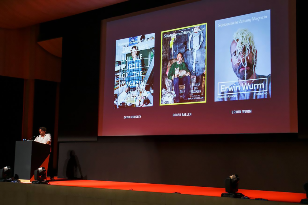
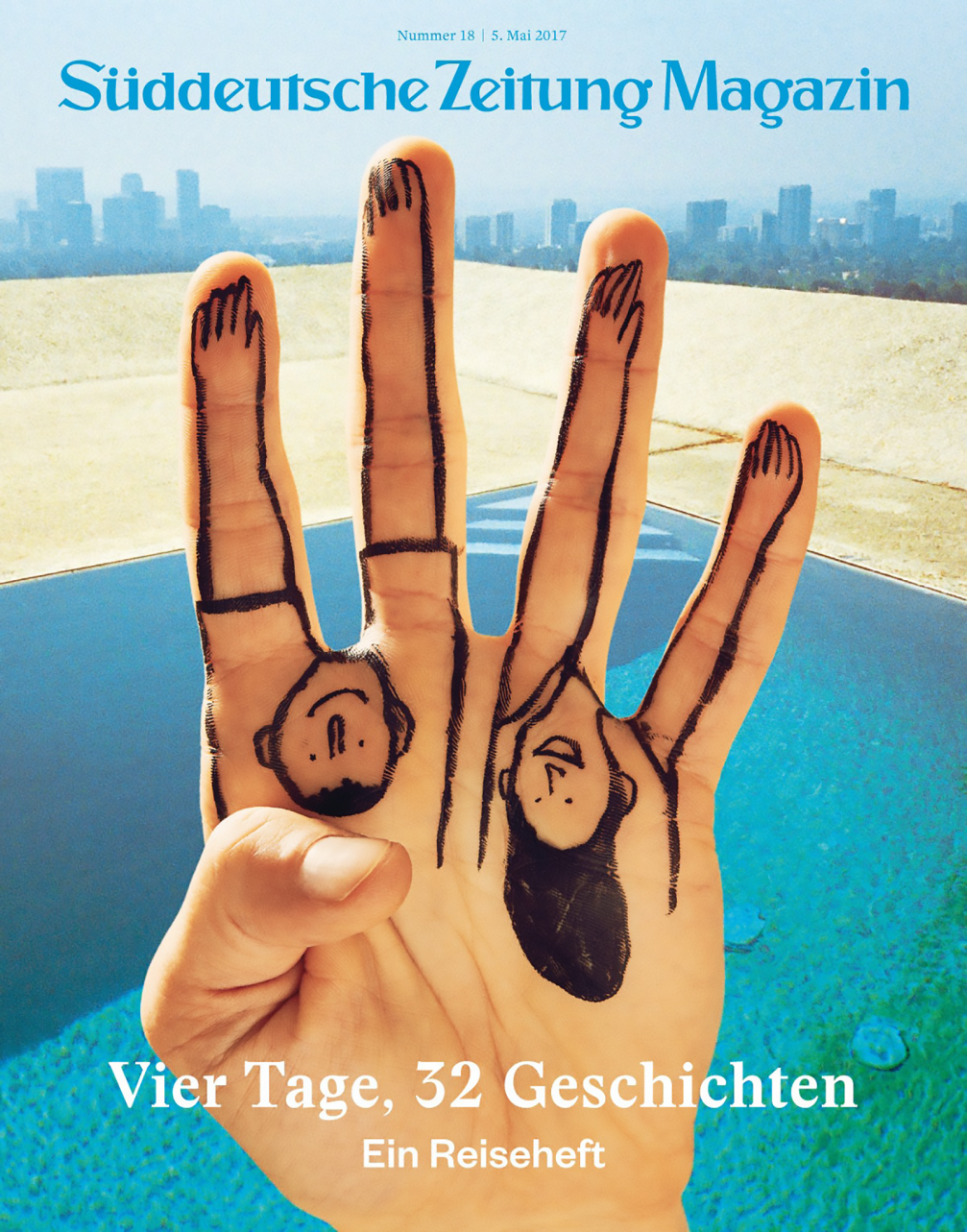
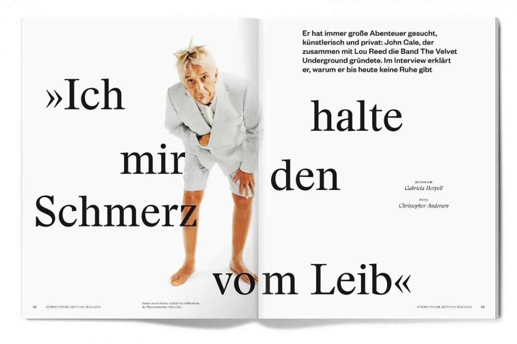
Since I’m in this industry for almost 20 years, I know the photography scene in Germany very well, we are almost like family. We have stories that suit various styles and when I see that a particular author could contribute to the magazine, I simply call. Sometimes I notice the authors in other magazines or online. We have a certain budget to be able to photograph ourselves or to commission works exclusively. We don’t use stocks. Maybe we don’t pay so much as advertising agencies do, but I believe that our projects are more interesting. The same applies to illustrators. Recently, I found a guy who has a very fresh approach. First, he bakes figures in an oven in his home Canada, then paints them and makes photos. I like to discover new things and create new collaborations. Today you can work with people from all over the world. Just write to them and ask. No one has said no to us. We have had the travel issue with illustrations by Jean Jullien, Christmas issue with David Shrigley…
Is there any magazine in Germany similar to yours?
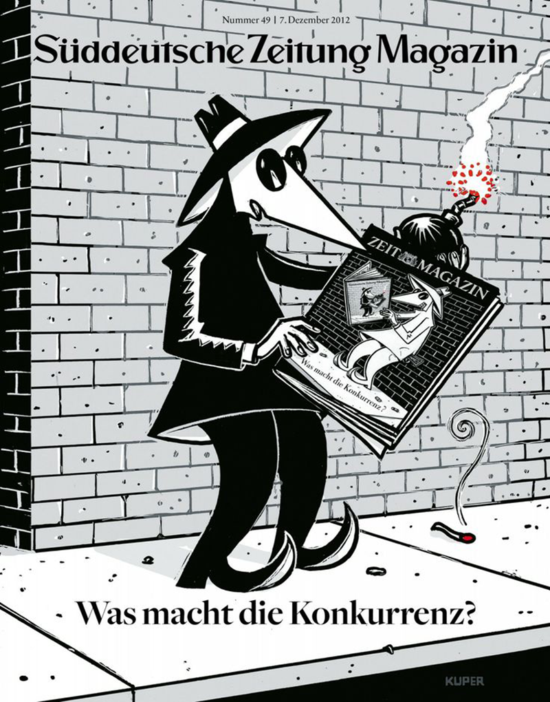
«Die Zeit Magazin» is kind of a competitor in the local market, its advisor to the art director is my friend Mirko Borsche. It is very similar. Once we decided to do a «competition issue» in which we both covered the same topics from two perspectives. How to visualise that we both do the same issue? There was this popular comic «Spy vs. Spy» about two agents who constantly try to kill each other. Our cover depicted one of them reading «Die Zeit Magazin» and vice versa. The stories were also connected, so the reader was able to get more out of it by reading them both.
What are the biggest challenges for you personally and for printed media in large?
In my work — a short time for production and too much text! (Laughs) The magazine should look good in the end and the biggest challenge is to achieve that it doesn’t look boring.
Otherwise, we are and we will be a classic printed magazine. Some parts of the content are available digitally as well but, I think, only a few magazines can successfully translate the printed version into the digital world. I’m afraid, we’re not the case. I don’t feel that our existence would be in danger, on the other side the habits of the audience are changing. Our readers become older. From the economic side, I wonder what will happen to advertising, because the future of it, sure, doesn’t lie in the printed pages of a magazine. Advertisers are interested in Instagram, product placement… At the moment, my job isn’t affected by that but the industry is.
What magazines do you value yourself, which ones do you follow?
I’m interested in many, big and small, from past and today. I always pay attention to how they handle the content. There is always some French magazine on my table, like the supplement to the «Le Monde» newspaper or «The New York Times Magazine». I like «The Sunday Times Magazine» as well.
My collection of magazines isn’t too freaky or nerdy, but, sure, I keep things that I like. Mostly I collect photography and photo books. Currently, there is Alec Soth exhibition in Hamburg and I am glad that we have had the chance to collaborate. If the photography connects with me, my work or time, if I can feel a story in it or it has something different in it, then it’s a good photography for me.
Can you share some of the ideas you have implemented in the «Süddeutsche Zeitung Magazin»?
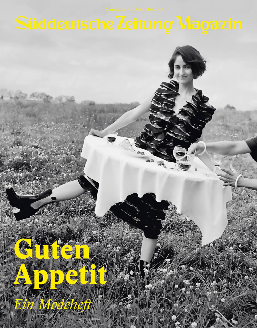
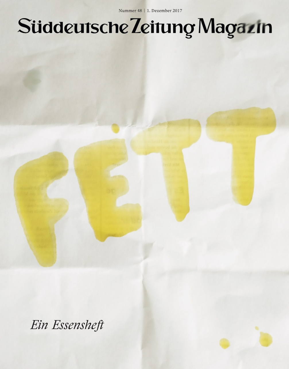
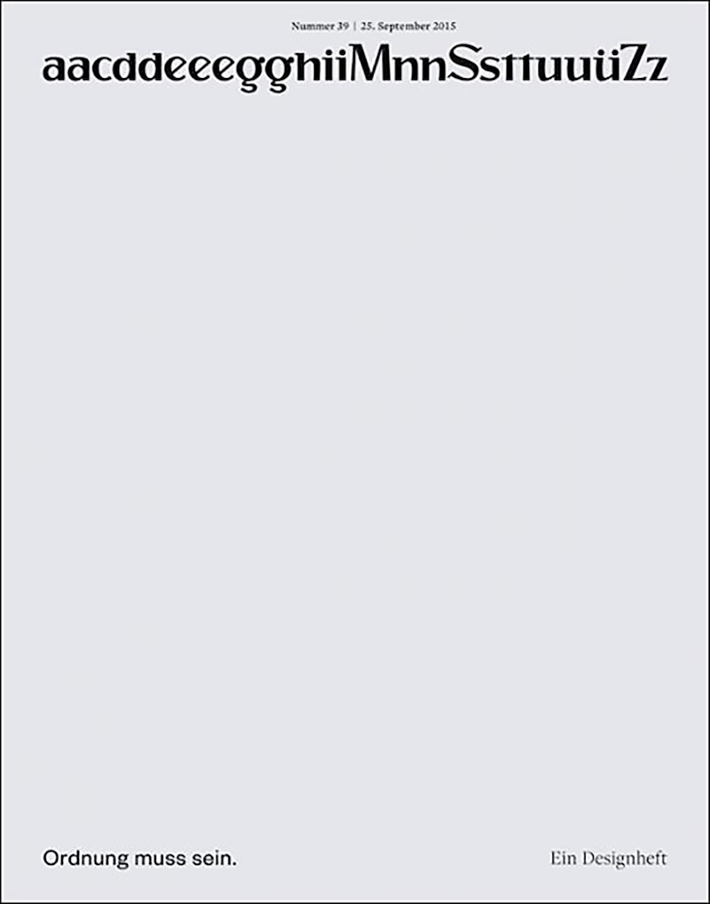
We always collect ideas and use them when the right time comes. Two times a year we have a design issue, but I don’t want it to look to designish. The main theme was order and organizing things and I just put the letters in our logotype in alphabetical order. I guess, these five minutes was the shortest time ever for me to create a cover.
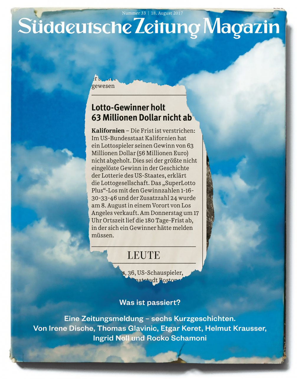
In a summer’s issue, we had short stories from established writers. Each of them told their version of one story that we took from real news — about someone who won a jackpot in a lottery but didn’t collect the money. We invited book designers to create fake covers for these fictional books. It was interesting, we brought together new people.
In another project, also in summer when the football championship took place, we created two magazines in one. One for football fans and the other for summer lovers, who are not interested in sports. Some time ago we discovered that due to the specifics of the paper, the magazine can be easily torn in two pieces so we used that. It seemed like a simple idea but it worked out very well.
Sometimes we have an idea and we just wait for the right story. Sometimes it’s more difficult. Once there was an interview about curiosity, but the professor who explained it wasn’t very interesting or well–known. So we bought a cheap phone and put the number on the cover without any explanation. After the publication we received thousands of calls and messages — the readers wanted to know whose number is this. It was their own curiosity.
We had an issue on food in the aesthetics of comics. When we had read that the society is more interested in cats than the much more serious topic of refugees, we put a cat in a refugee boat on the cover, so people get disturbed. We don’t do such things all the time, but there has to be something special from time to time to surprise readers.
Being a creative person, you could certainly use your ideas in other, probably, better–paid industries such as the above–mentioned advertising. Why did you decide to work in media?
I remember myself drawing since I was a kid, I did graffiti too. Then I went to study graphic and communication design. One of my greatest influencers was Fleckhaus (Wilhelm August «Willy» Fleckhaus, 1925–1983), very famous German art director, a legend. He inspired me to do magazines. After studies in the 1990s I have worked for a year at an advertising agency, but I’m not the advertising type. Me and my friend, we then began to work in a youth magazine, and since then we are both still in the media industry.

Viedokļi