In the Netherlands, graphic designers are constantly experimenting, pushing borders of their field. When seeing the exhibition of Arnhem Institute of the Arts graphic design department, many viewers notice that projects by this year’s graduates are rather unusual for graphic designers. Among them is Latvian Monika Grūzīte, who has sent us an overview of the most important directions, marked by the young designers’ works.
The best BA programs in graphic design in the Netherlands are in the Gerrit Rietveld Academy in Amsterdam and the Arnhem Institute of the Arts (ArtEZ). The former is internationally more acclaimed and known abroad, while the latter is rather local. I chose Arnhem, because it seemed a school of a more classical approach. The lectures were mainly held in Dutch, and from this year’s graduates, I was the sole foreigner.
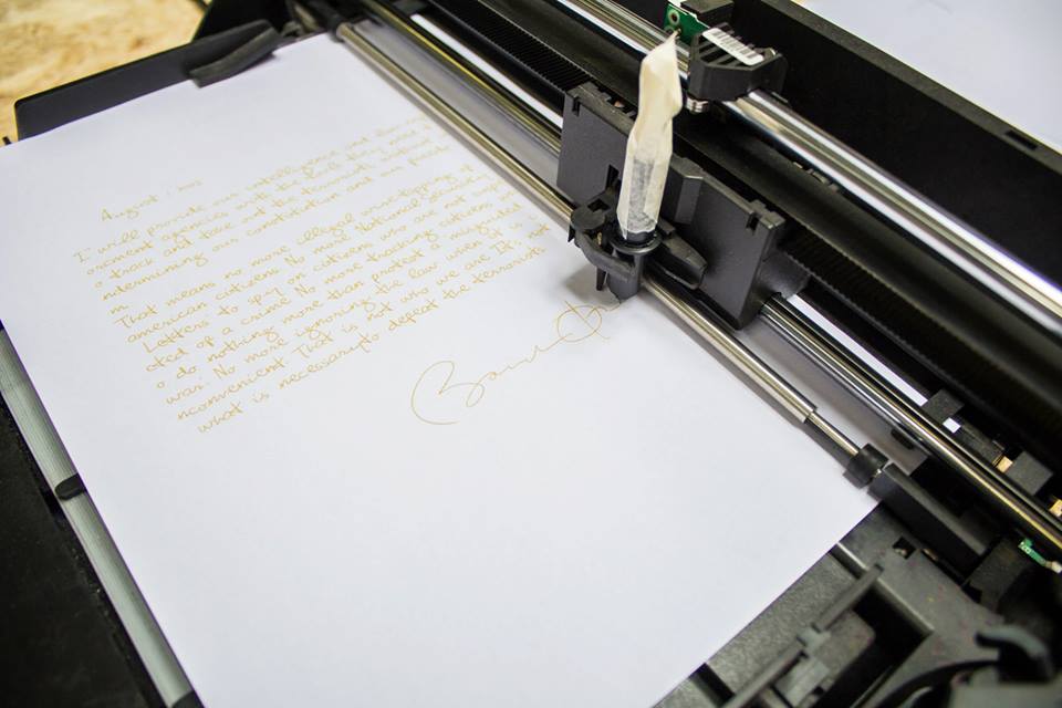
Arnhem school of graphic design has previously been known for its typography, and its systematic and even formally rigid approach. I studied for three years at the ArtEZ, and during this time we made a lot of books, posters and newspapers. However, this year brings change. Only rarely did anyone choose a classic approach — in the show, there are hacked printers that print in Obama’s handwriting, robots that draw posters by communicating among themselves, and other installations. Some winds of change were brought by Thomas Castro, who, for several years, was our typography teacher and who is now the head of the Department of Graphic Design. He is quick to emphasize, though, that the main change isn’t the opposition between print and digital / interactive design but the vision and ability to thoroughly carry out one’s critical view with an appropriate medium. In this show, the traditional principles of graphic design — typography, skill, intuition — are viewed through speculative design, open–source, DIY tools, generative design, meta–language, and data acquisition.
Each graduate spent several months researching a topic that was closest to their heart. In the end, what was judged was designer’s visual language and skills, as well as the process and depth of the research. In contrast with the previous years, we drew more attention to the fact that, in a graphic show, what is also important is the viewer’s experience while looking at the works. Because this year the show for the first time took place in a specially rented space in the town centre, and we ourselves were responsible for its arrangement, we felt that everything was possible. Seeing the show in its entirety, it could be noticed how some themes and perspectives ran through several works.
The systematically poetic
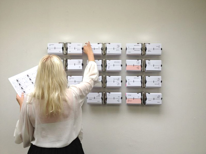
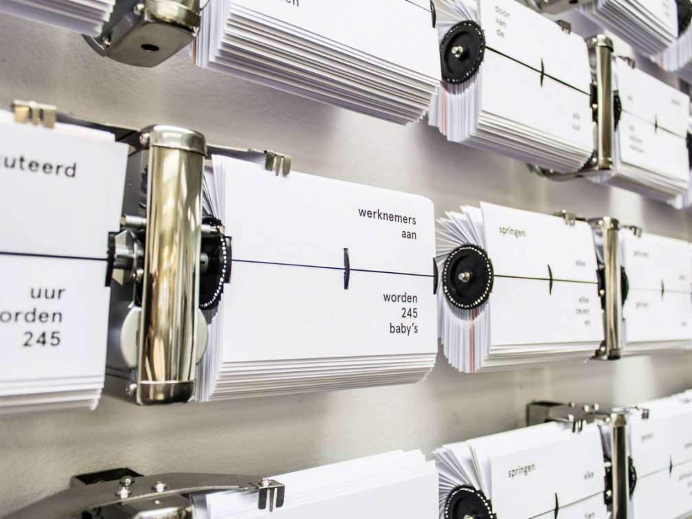
In the school, many took on language analysis, narrative creation and categorization through design. Often there was some book with a non–linear reading approach, posters where readers could arrange their own texts, or topics indexed in a form of a phonebook. In the show, much attention and praise was directed at Anne Kolkman’s designed poetic timepiece where one could read story rhythms happening simultaneously at different places. Every 30 seconds, someone begins to read a Harry Potter book, and every 12 days, 4 hours and 48 minutes someone tries to jump off the Golden Gate Bridge in San Francisco. As the clocks go, each minute, a new page is turned, and new stories and their combinations are born.
The graphically interactive
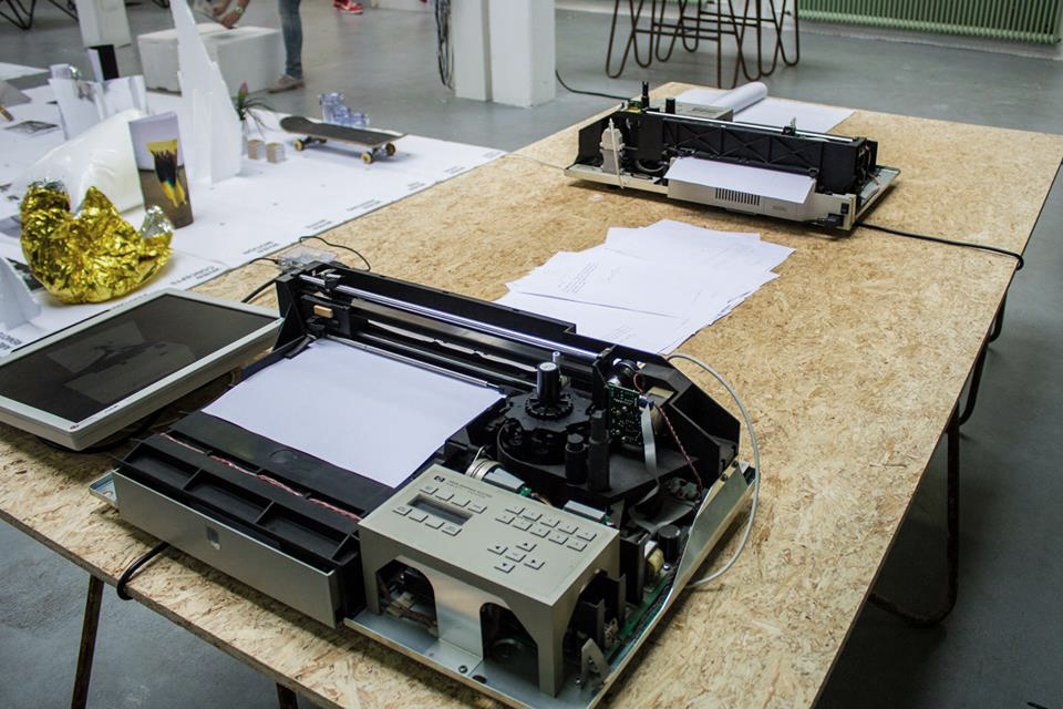
Convergence of the interactive and graphic design is nothing new. But what would an interactive work look like if a graphic designer made it from their viewpoint, without trying to outdo interactive professionals with their own weapons? It shouldn’t be anything technically difficult. In the work of Gijs de Heij, pre–election Barack Obama corresponded with post–election Obama. It consisted of two hacked printers that printed letters in Obama’s handwriting, and signed by him, with pre–election promises and post–election amendments.
The socially political
In the recent years, design research is also taught in Arnhem. This approach is characterized by a critical study of current affairs through a designer’s personal perspective; it could also be called visual journalism. What is important is the designer’s ability to be an author and a content creator. Among the most capable teachers of design research are Vinca Kruk and Femke Herrengraven. In their professional life, they are also known for their research into political and economic issues. Sometimes it is self–initiated works or commissions for design shows, and sometimes their clients come from cultural and art institutions.
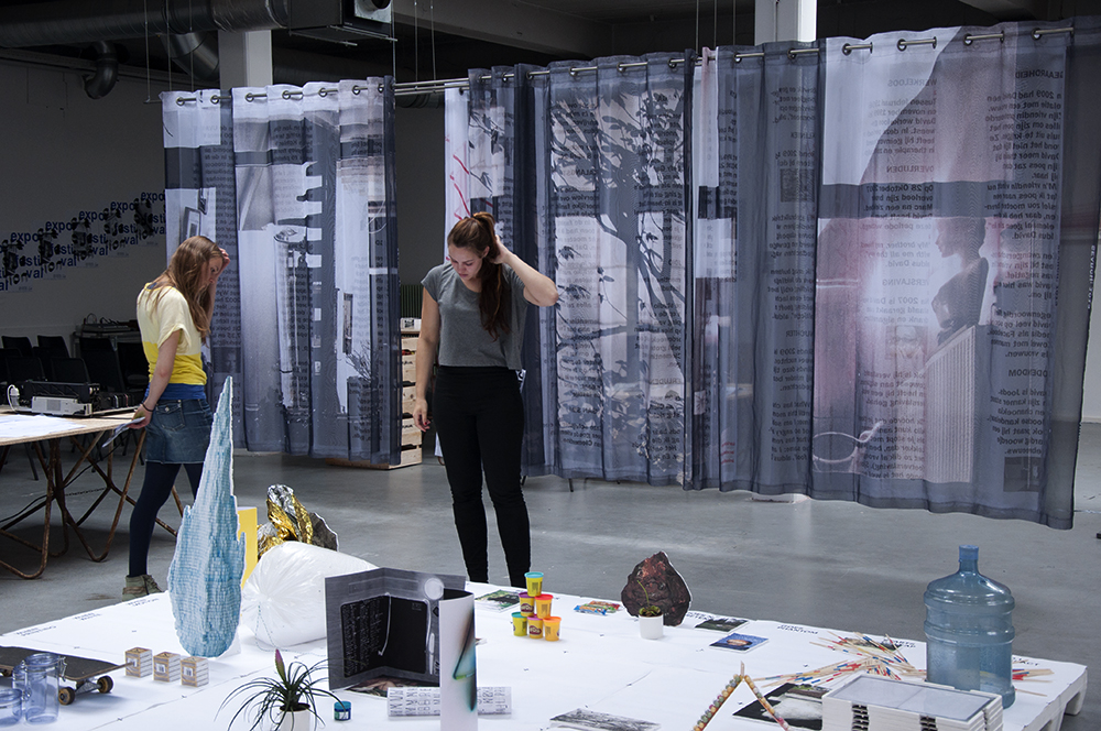
Fee Kokke’s story on privacy has been printed on three layers of curtains. For three months she had worked as a designer – stalker in order to create portraits of several residents in Amsterdam. In the darker hours of the day, large windows of Amsterdam’s dwellings lure the curious passers–by to peak into the living rooms. Fee photographed a small street in Amsterdam and then, guided only by the address data, searched the internet not only for names of the residents, but also their psychic problems, favourite pastimes and substance addictions, as described on their blogs.
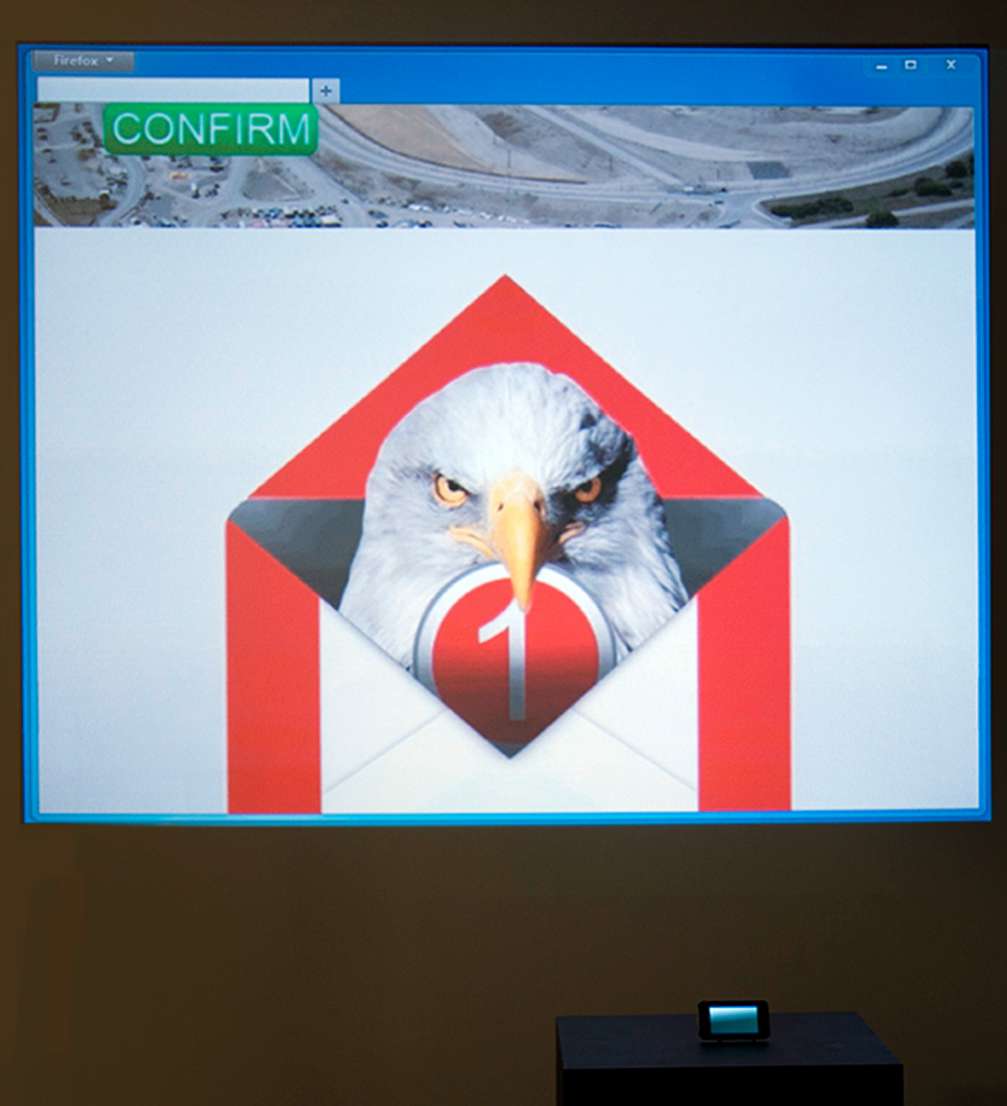
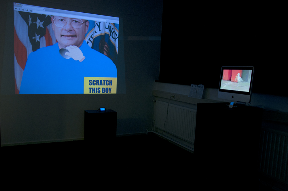
I, too, got hooked on design research, although I began my studies with an intention to enhance my skills at typography. For the last three years, I mostly made print works and was quite sure that my final project would be of newspapers. Then I began to study personalized ads on the internet, and data acquisition, and this is how I came to looped screenshot gif films about how every our action online is recorded, analysed and commented on.
The contemporary traditional
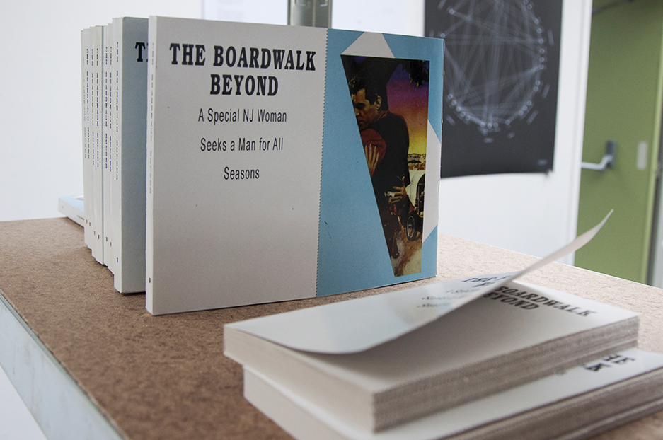
It wasn’t that our show didn’t have a single book or other more or less traditional work of design. Danielle Verdoes’s romantic book of «Craigslist» dating ads surprised with its simplicity and wit. The book consists of two parts — Man’s ads, where he looks for a BBW (big beautiful woman), and the Woman’s part, in which she looks for her sexy man. Both parts are divided by a perforated line. In order to read the book, it must be split into two, but, when it’s done, The Woman and The Man are destined not to find each other.
Is it really graphic design?
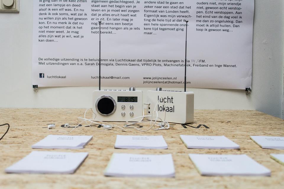
Is it possible to graduate with a distinction from a design school without an obvious final work in design? Jolijn Celeen created a radio program of narrow reception, with different stories and sounds, which could be listened to from different points, navigating the exhibition space. Depending on a chosen trajectory, the stories were arranged in a new sequence. This work is a vivid example of blurring borders of graphic design.
It is possible that some of these works are intellectually oversaturated and could not be understood without an explanation. These are not problem–solving solutions. The school’s intention is to train independent designers, develop their research and analytic skills through design, understand the designer’s role, and find a personal approach. In my view, the school is a good platform for both practical and experimental design. For designers, it is essential to question the status quo. The works in the show are clearly confident and even daring quests on and beyond the borderline of graphic design.

Viedokļi